13 best website layout ideas + examples to inspire you
Choosing the right website layout is a very important step when designing a website. A good layout affects how people will act when they visit your site. It can help you guide visitors to where you want them to go, and turn casual browsers into loyal customers.
In this article, we’ll present 13 website layout ideas to help create an effective site that stands out. We’ll also provide real-life examples of each website layout, all made with Hostinger Website Builder.
What is a website layout?
website layout organizes text, images, buttons, and menus on a webpage. A good layout simplifies navigation, which helps create a seamless user experience. It also helps boost brand credibility by setting a positive first impression.
13 best website layout ideas
Every website layout has a specific purpose and unique design features. We’ll help you understand which layout best suits your needs, making it easier to choose the right one.
1. Hero layout
The hero layout places a large, eye-catching image or video and often comes with a compelling call to action (CTA). CTAs improve the hero layout by creating a focal point in the big visual. While the image or video catches attention, the CTA encourages action.
This layout design is perfect for product launches or campaigns. It also works for any site aiming to make a bold first impression with a clear, impactful message.
To make the most of a hero layout, use high-quality visuals that resonate with your brand message. Ensure the CTA stands out with contrasting colors and clear wording.
For example, Nativa Indo uses a hero layout with a large, high-quality image that reflects its brand identity straight away. The CTA button stands out with contrasting colors, guiding visitors to learn more about the company.
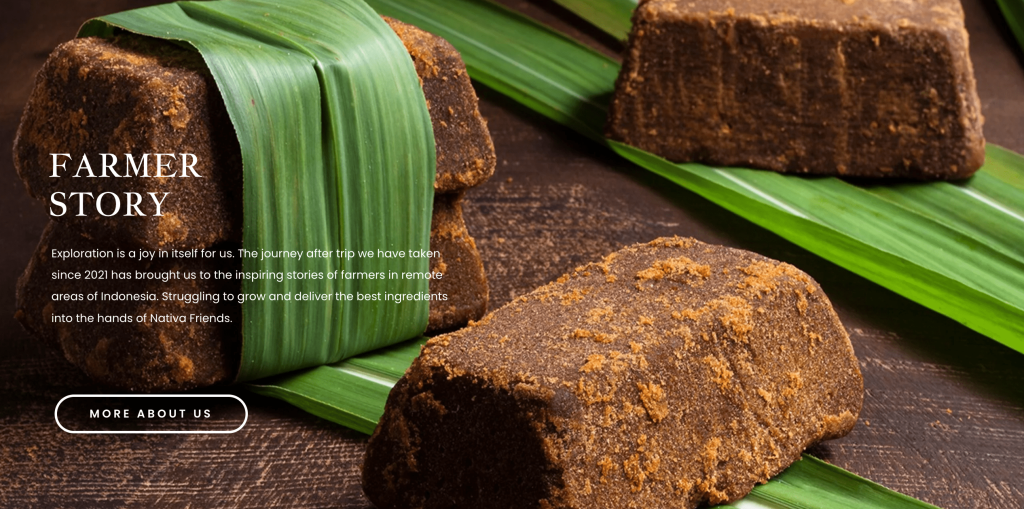
The brand uses the same layout throughout the page, which helps create a strong impression of Nativa Indo and its products.
Aside from an image, you could also use a video background to emphasize the effectiveness of the hero layout. With Hostinger Website Builder, you can add a video background to your website in a few clicks.
On the page section, click Edit section and go to the Video tab.
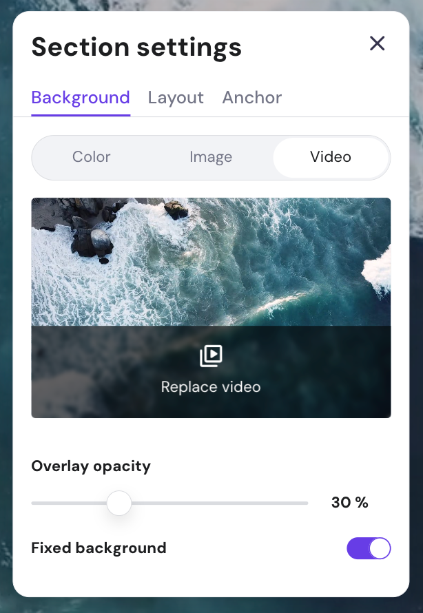
Choose Replace video, which will open the free videos library. From there, you can select the video background for your website.
2. Z-pattern layout
The Z-pattern layout matches how people read, guiding their eyes in a Z shape from left to right and down the page. This layout highlights key elements, making it easier for visitors to take action.
This design places the logo and menu at the top, key content in the middle, and strong CTAs in the bottom right corner. It’s perfect for landing pages with clear conversion goals, like getting sign-ups.
3. F-pattern layout
The F-pattern layout fits how people read text-heavy websites. They scan across the top and down the left side, forming an F shape. One option is to place main information like headlines, value propositions, and CTAs above the fold, where eyes naturally land first.
As users read down, subheadings and bullet points should align with the vertical line to maintain focus. The middle horizontal line can highlight key details, social proof, or testimonials.
This layout works well for blogs and content-heavy websites where readers look for information quickly. Cupid Club is one example of the F-pattern layout.
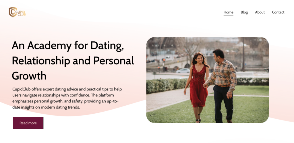
The homepage uses an F-pattern layout, placing important information on the left and a featured image on the right. This design helps guide visitors’ eyes naturally along the page.
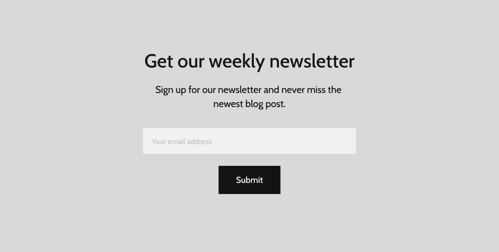
Scrolling down the page, you’ll find a final call-to-action inviting visitors to subscribe to Cupid Club’s newsletter.
4. Grid-breaking layout
The grid-breaking layout moves away from traditional grid designs for a more dynamic look. It uses overlapping page elements and unique shapes to add depth and catch the eye of the visitor.
Also called the broken grid layout, it’s perfect for creative portfolios and innovative brand websites looking to stand out and showcase originality.
Use contrasting colors or bold text to help guide the viewer’s eyes through the layout. Take a look at Jose Narciso’s art portfolio to inspire you.
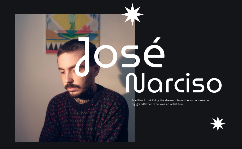
Using the broken grid layout on the top fold, Narciso overlapped the text with his self-portrait. This simple but impactful design immediately draws the viewer’s attention and sets the tone for his artistic approach.
With Hostinger Website Builder, you can easily create this overlapping look. Just drag a website element outside the grid. To change its order, right-click and select Send to back or Bring to front.
5. Content-focused layout
The content-focused layout prioritizes text with a simple, clean design highlighting the content. Use bold fonts, plenty of white space, and keep distractions to a minimum for this website type.
This style is perfect for blogs and news sites. The simple design helps share articles and stories without distractions. Hostinger Website Builder’s template Kodah is a great example of a content-focused website layout.
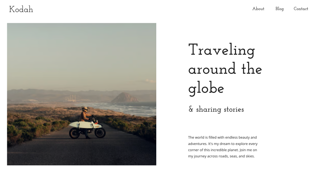
Using a white background with a few images, this minimalistic and simple website template helps site visitors focus on the blog content.
6. Fullscreen image layout
The fullscreen image layout uses a full-screen photo on the homepage to create an impact. High-quality visuals and a strong tagline are key to this website layout. They help communicate your brand’s core message.
This layout works well for businesses and individuals looking to leave a solid first impression.
Choose a high-quality image that reflects your brand and set it as your homepage background. Keep the text concise and impactful. Fett Burger’s landing page is a great example of this practice.
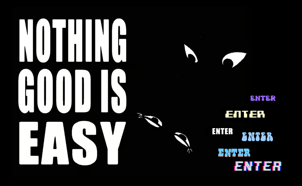
It features a fullscreen image, a tagline, and a button to enter the site, making it easy for visitors to navigate.
7. Alternating layout
The alternating layout features two columns that switch content blocks left and right. This layout is excellent for making website content more engaging and less monotonous.
Typically, one section has an image on the left and text on the right, while the next section flips them. This zigzag pattern keeps visitors engaged, creating a dynamic reading flow.
It’s great for storytelling websites or pages that show information in order. This helps readers follow along with the content easily. The Glass Mama website uses an alternating layout to showcase its services.
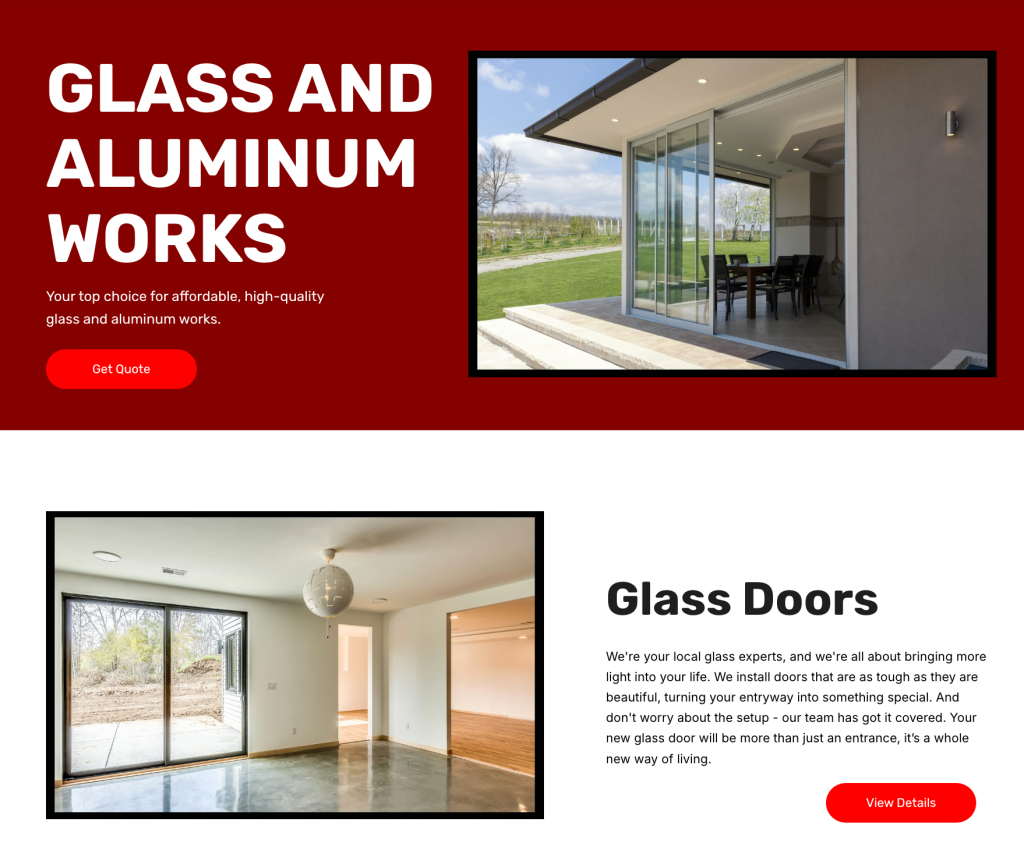
As you scroll down the page, images and descriptive text alternate, making it visually appealing and easy to follow.
8. Asymmetrical layout
An asymmetrical layout creates visual dynamics by placing elements unevenly across the page. It uses color contrast, size, and visual weight to emphasize key content and guide the viewer’s eye. This layout helps boost site engagement with a bold and creative design.
Place elements like text blocks, buttons, and images unevenly. For instance, balance a large image on one side with several smaller text blocks or graphics on the other.
Hostinger Website Builder’s Joplin template is an example of an asymmetrical layout. The top fold showcases an asymmetrical layout with uneven image and text sizes. This helps create a unique and engaging visual experience.
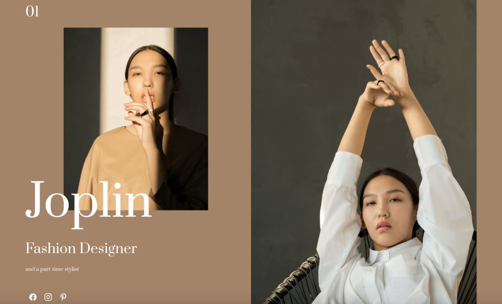
As users scroll, the layout plays with visual weight and spacing. It also uses bold color scheme and varying element sizes to maintain interest.
9. Single column layout
The single-column layout offers a simple, clean design that guides users to scroll naturally for more information. To make the content easy to digest, it’s important to break up text with images, headers, and sub-headers.
This layout is ideal for long-form content websites like blogs and social media feeds, where clarity and readability are key.
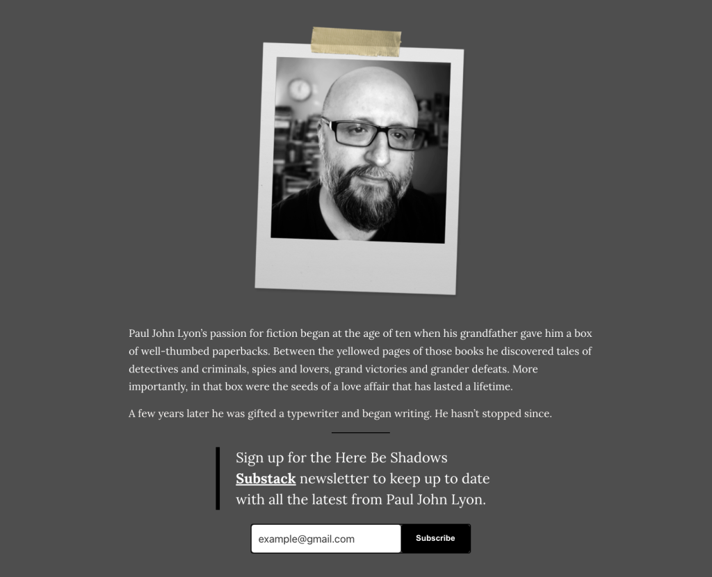
Here Be Shadows by Paul John Lyon uses a single-column layout with a white background. The clean design keeps visitors focused on the content and makes the text easy to read.
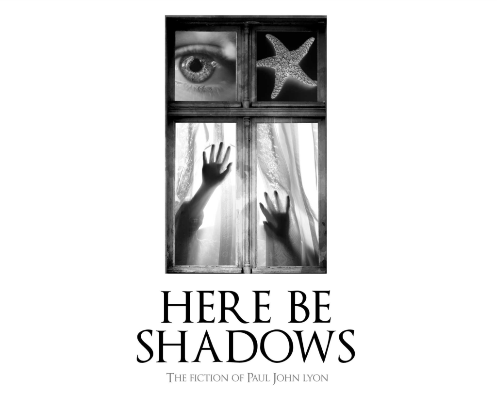
Using grey helps draw attention to important parts, like Lyon’s bio. This color change adds variety to a single-column design while keeping a unified look.
10. Box-based layout
The box-based layout arranges content into neat, geometric shapes. This layout works well for eCommerce sites, allowing easy organization of products into boxes.
To create a good box-based layout, balance visual appeal with functionality. Each box should be appealing on its own but also fit seamlessly into the overall grid design.
Jessien Fashion website uses the box layout design to showcase its online store products. The grid format helps site visitors scan through various items without feeling overwhelmed.
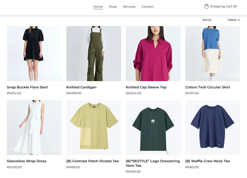
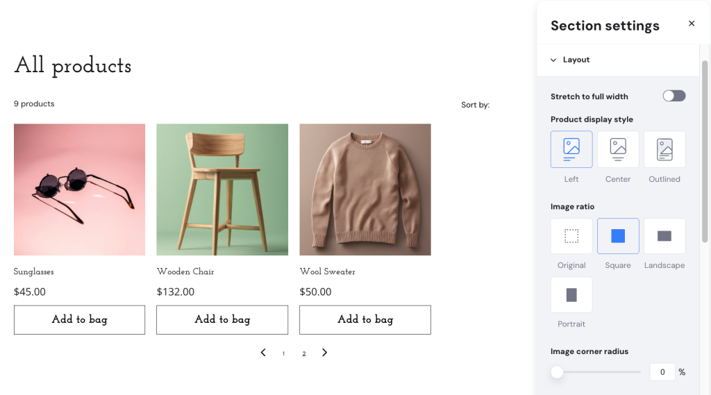
By default, Hostinger Website Builder applies the same layout design to showcase products. If needed, you can change the layout by going to Section settings → Layout. Choose the image ratio accordingly.
11. Cards layout
The card layout features a flexible design that showcases content in uniform containers. This approach makes browsing and interaction effortless. Each card has a modular layout and includes a piece of information or media, like an image, text, or video.
It’s a great choice for vlogs, online stores, or sites that need to showcase multiple items or articles in a visually appealing way.
Use clear, concise text and high-quality images to make each card stand out. Add a clear CTA on each card, such as Read more or Buy now, to guide users on what to do next.
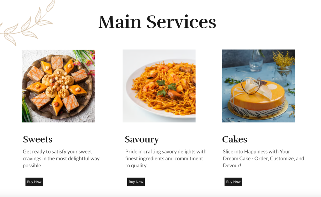
Baba Bakehouse’s website effectively uses the card layout in its product catalog. Each card features a product image, name, short description, and a button to order. This makes it easy for customers to browse and select products.
12. Magazine layout
The magazine layout draws inspiration from printed newspapers. It features a multi-column grid that organizes content into sections. This design highlights important headlines and breaks up large content into easy-to-read sections.
It’s perfect for news sites and blogs that need to present information clearly.
13. Horizontal strips layout
The horizontal strips layout divides a webpage into full-width sections, creating clear, distinct content blocks. Using different colors, images, and effects adds depth and a dynamic feel to the website design.
This layout is great for one-page websites with long scroll designs. It allows content to flow seamlessly while being visually engaging.
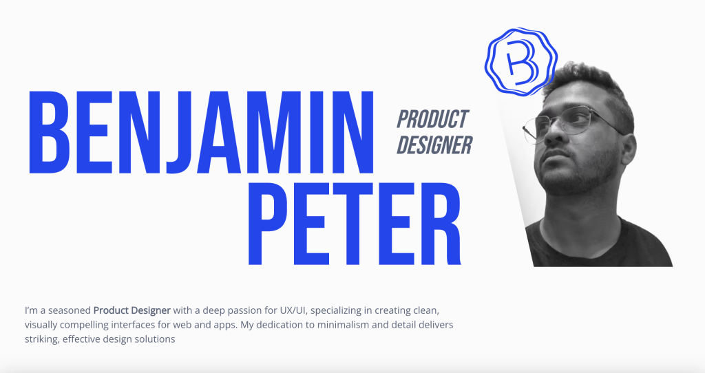
We’ll look at Benjamin Peter’s website as an example. The landing page features horizontal strips in different colors with the same harmony. This design clearly identifies each content block while maintaining a consistent look.
Conclusion
Choosing the right website layout is important for creating a visually appealing and user-friendly site. Here are some top layout designs to consider:
- Hero layout. Perfect for making a bold impact with a strong visual and call to action.
- Cards layout. Great for organizing content-rich websites like blogs or online stores.
- Grid-breaking layout. Ideal for creative portfolios and brands looking to stand out with a dynamic design.
Find the website layout that best suits your website’s purpose and message. Use colors, typography, and images to help make your website layout represent your brand.
You can also take inspiration from the top website layout examples created with Hostinger Website Builder. Remember to keep your website layout clean, organized, and easy to navigate.
Finally, experiment with different website layouts and make changes as needed.
Website layout ideas FAQ
What is a good layout for a website?
A good layout is appealing, easy to navigate, and aligned with the website’s purpose. It should guide users to important content and encourage interaction, such as scrolling, clicking, or exploring further.
How to choose the right website layout?
Choose a layout based on your content type, audience, and goals. For visual impact, try a hero or fullscreen image layout. For text-heavy sites, consider F-pattern or single-column layouts. Always prioritize user experience and readability.
What are the four main parts of a website layout?
The four main parts are the header, content area, sidebar, and footer. The header includes navigation and branding. The content area displays the main information. The sidebar offers extra links or info. The footer provides contact details and secondary navigation.

Nurul Siregar has over 3+ years of experience in the tech industry with a passion for writing about digital marketing. Nurul enjoys reading fiction novels and making digital illustration in her free time. Follow her on LinkedIn.