15+ best portfolio website examples for personal brands, photographers, artists, and more

A digital portfolio helps highlight your best work and increase online visibility, opening up opportunities for potential employment and collaborations.
Before building your online portfolio, it’s a good idea to explore some of the top portfolio website examples for inspiration and insight into current trends.
This article will showcase 15+ portfolio examples from various professions, such as writers, students, and public figures, highlighting what sets each one apart. We’ll also talk you through the steps of creating a portfolio to captivate potential clients.
Top portfolio website examples
From personal brands and public figures to artists and photographers and beyond, we have listed our favorite portfolio websites below to inspire and give you ideas.
1. Enrico Deiana
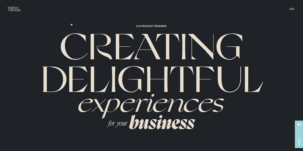
- Why it’s special: multiple micro-interactions
Enrico Deiana is an Italian-based product and web designer. When visitors arrive on his website, they’re greeted with a swipe effect and a bold typographic hero image, instantly showcasing what he does and making a strong first impression.
As you scroll, you’ll notice various micro-interactions, such as cursor changes over links and background shifts when hovering over portfolio areas.
These micro-interactions sweeten the user experience by making the website feel more dynamic and engaging, keeping visitors interested as they explore the portfolio.
2. Sean O’Brien
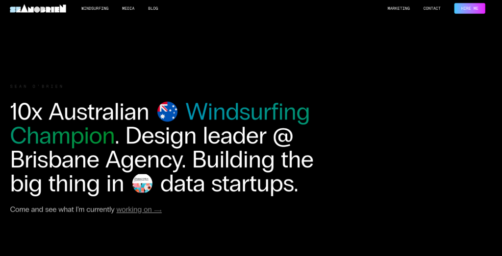
- Why it’s special: a strong personal brand and a country-code domain name
Sean O’Brien is a championship-winning windsurfer who immediately communicates his identity on the homepage with bold text above the fold. Visitors quickly grasp who he is and what he has accomplished.
The bold, colorful design reflects Sean’s passion for windsurfing. Various photos of him and large, simple fonts make the content on this portfolio website easy to digest.
As an Australian athlete, he uses the .au country-code TLD, signaling to search engines and visitors that his website has a local focus.
3. Russell Brand
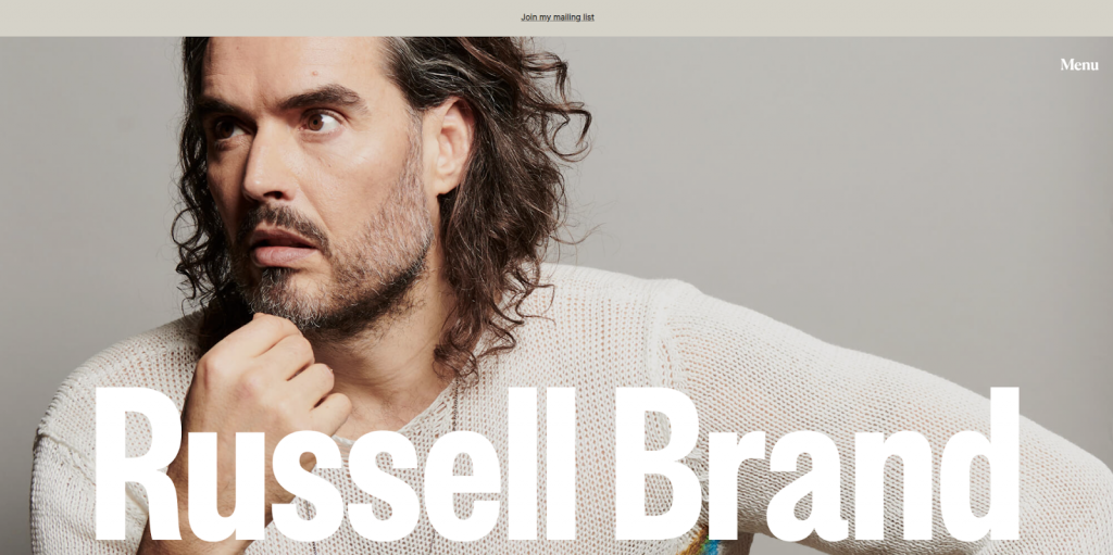
- Why it’s special: newsletter banner and booking feature
Russell Brand is a well-known actor, comedian, and mental health and drug rehabilitation activist. If you champion multiple causes, structuring your portfolio website in a similar manner can help keep visitors better informed and engaged.
The site features his books, podcasts, stand-up comedy videos, and event dates, making it easy for fans to book tickets directly. It also encourages community engagement through a mailing list, with a newsletter banner prominently placed at the top.
Designed with an earthy tone palette and serif fonts, the website incorporates crow-like imagery, a symbol of change and transformation well-known to his followers.
4. Lior Raz

- Why it’s special: informative one-page portfolio site and hero video
Lior Raz’s one-page website stands out for its visually appealing and straightforward design, offering a clear introduction to his work as an actor and public speaker.
The homepage features a hero video with clips from Lior’s films, immediately capturing visitors’ attention. His portfolio site is divided into five sections—About, Gallery, Press, Speaking, and Contact—keeping the layout clean and organized.
Each section expands with a click, avoiding clutter, and a hamburger menu ensures quick and easy navigation. Full-width banner images and a dark background draw attention directly to the content, minimizing distractions.
5. Cristiano Ronaldo
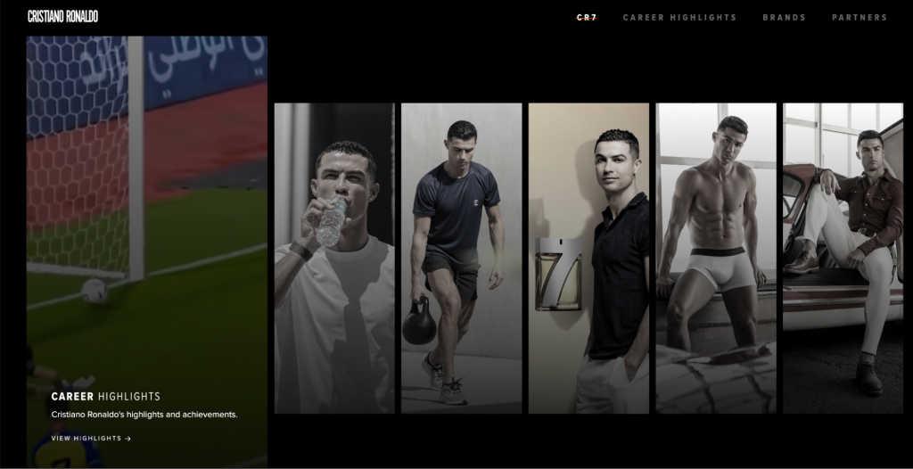
- Why it’s special: career highlights
Cristiano Ronaldo’s portfolio website is a great example of an effective one-page layout. It showcases his diverse projects and career highlights.
The top section features his ventures, from soccer to fashion, with a card-based layout linking each image to its respective online store. As you scroll, a horizontal slider outlines his career journey, with each slide featuring a short video of his contributions to different clubs.
In addition to career highlights and brands, the page includes a video of his latest product, a newsletter signup form, and links to past partnerships, making it both engaging and informative.
6. Bill Gates
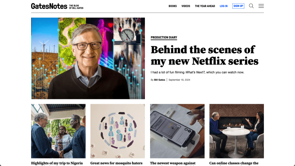
- Why it’s special: personal timeline and magazine layout
Bill Gates’ website is an excellent portfolio example for those looking to highlight their work, share updates, and offer knowledge.
The site uses a magazine-style layout to neatly organize posts into categories such as Climate and Energy, and Education. The top of the homepage highlights new or trending articles for easy access.
The black-and-white color palette keeps the focus on impactful images and YouTube videos, while a simple hamburger-style menu ensures quick navigation.
The About page stands out with an interactive timeline slider. It showcases Bill Gates’ journey across Microsoft, the Bill & Melinda Gates Foundation, and other projects, accompanied by representative images.
7. Tamara Sredojevic
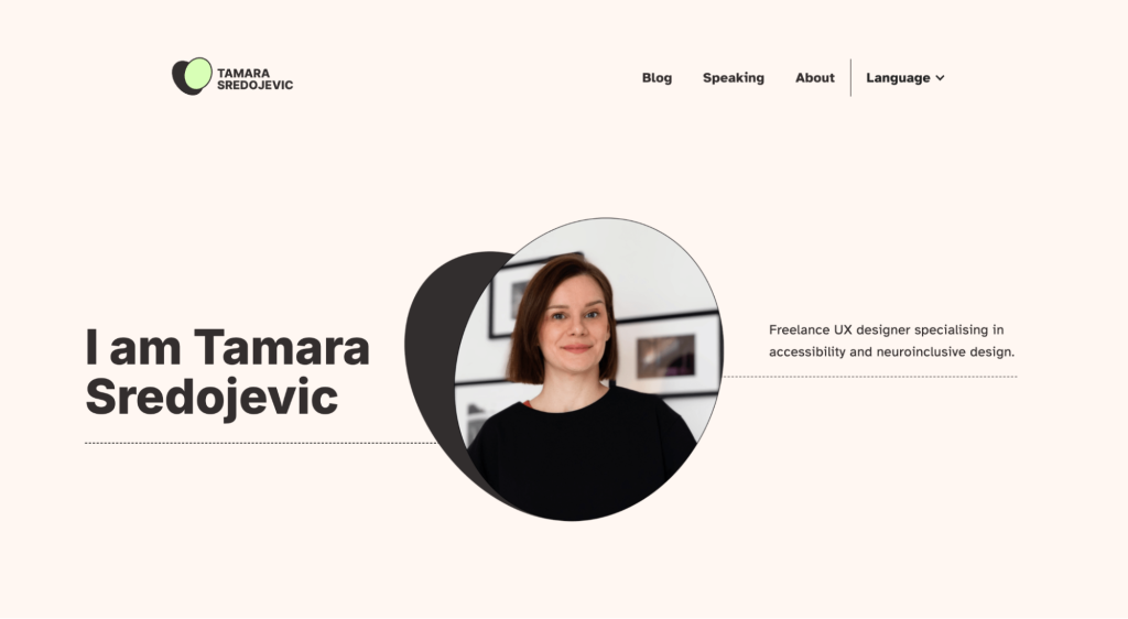
- Why it’s special: unique value proposition and focus on accessibility
Tamara Sredojevic’s portfolio is an excellent example of how personal values can be reflected in web design. Specializing in accessible and sustainable UX design, she outlines her target market on her homepage, including non-profits, charities, and ethical brands.
In addition to highlighting her core values on the About page, the footer links to an Accessibility Statement, reinforcing her commitment to her niche. The portfolio’s simple design uses large shapes, thin lines, and muted colors, resulting in an intuitive browsing experience.
8. Demas Rusli

- Why it’s special: hero image
Demas Rusli’s portfolio is a stunning showcase of his urban, architectural, and aerial photography, appealing to his large social media following.
The homepage features full-width images that rotate every five seconds, capturing your attention immediately. His work is organized into three sections—a hero image, photo categories, and his Instagram feed, giving visitors a clear view of his talent.
He divides his portfolio into six categories—Commissions, Urban, Aerial, Architecture, Nature, and Fantasy. This makes it easy for clients to explore specific themes.
Each gallery layout is tailored to the category, with a grid format for commissions featuring images or GIFs and buttons for seamless navigation between categories.
Pro tip
Check out some top photography website examples for inspiration, and try Hostinger Website Builder to create your own photography site.
9. Alice Lee

- Why it’s special: a minimalist design for illustration portfolios
Alice Lee’s portfolio is a visually captivating example for illustrators, showcasing her work in a simple yet effective design.
The homepage features a subtle animation where the hero image moves with the visitor’s cursor, adding a playful touch. Below, she displays her projects on a minimalist layout with a white background, letting her vibrant illustrations take center stage.
Each project includes a description and her drafts, offering insight into her creative process. If you’re looking for more inspiration, we have curated a list of the best art portfolio website examples for aspiring artists.
10. Lauren Hom

- Why it’s special: behind-the-scenes content and educational blog
Lauren Hom’s portfolio reflects her vibrant style as a designer, illustrator, and lettering artist known for using bright color palettes and playful letterforms.
Her website features shades of green for the background and orange accents for hyperlinks and call-to-action buttons, making key elements pop. Lauren shares behind-the-scenes photos alongside her final projects on the Work page, offering a deeper look into her process.
She also writes blog posts about murals, lettering, and freelancing tips, enhancing her portfolio’s visibility in search results while sharing her expertise.
11. Todd Clarke
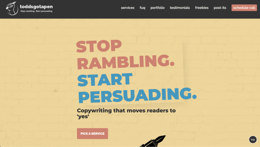
- Why it’s special: engaging copy
Using the brand Toddsgotapen, Todd Clarke demonstrates that an engaging portfolio website doesn’t need complex animations. As a copywriter, he keeps the design simple, relying on his words to grab visitors’ attention.
His copy is direct and catchy, with large headings to structure the content and bold sentences with icons to highlight key points. The Portfolio page features clickable categories for easy navigation, with images linking to live websites or full-screen project previews. To build credibility, Todd also includes a dedicated Testimonials page.
In the footer, he humorously crosses out other social media accounts, pointing visitors to his LinkedIn profile as his primary contact.
12. Muriel Vega
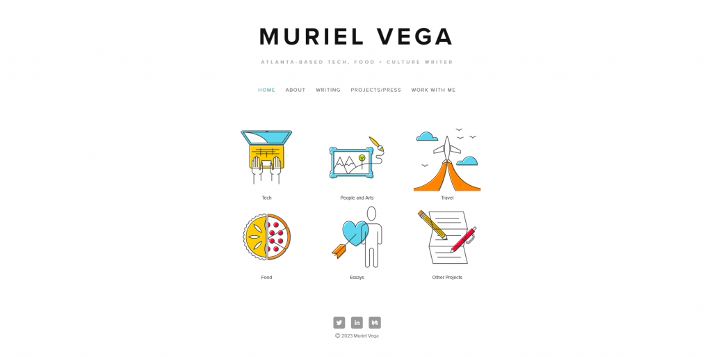
- Why it’s special: straightforward navigation
Muriel Vega’s portfolio is a simple yet effective showcase of her work as a freelance tech, food, and culture writer, having collaborated with brands like The Guardian and Patreon.
The homepage highlights her job title, a clean menu, six linkable illustrations to differentiate her projects, and social media icons, making it easy for visitors to navigate and explore her work.
Her portfolio is arranged in a grid layout, with each image, article title, and company listed to emphasize her diverse writing experience and credibility visually.
Muriel’s About page is concise, focusing on her previous writing experiences to provide potential employers with a clear understanding of her background.
13. Helena Bowen
- Why it’s special: strong above-the-fold section
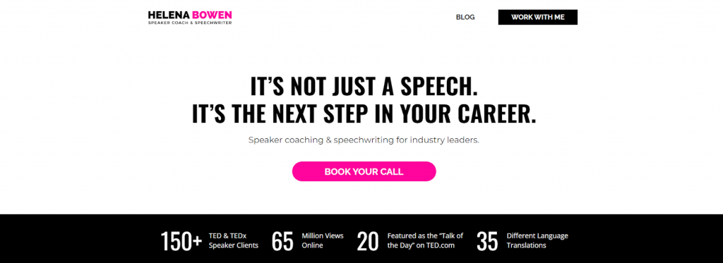
Helena Bowen is a top speaker, coach, and speechwriter who has worked with over 150 clients, garnered millions of online views, and been featured on platforms like TED, CNN, and National Geographic.
She uses the above-the-fold section of her homepage to immediately attract potential clients by showcasing her impressive stats, including the number of clients, language translations, and views.
Her website design is simple, with ample whitespace and professional photos that keep the focus on content. Intense colors highlight key information for a polished, professional look.
14. Duygu Mühürdar

- Why it’s special: simple user interface, clean navigation
Duygu Mühürdar is a booker, live event producer, singer, and music writer. Her portfolio effectively balances written and visual work using clean thumbnails on the homepage.
Each thumbnail in the menu follows a minimalist design with ample white space, maintaining a neat, organized look. Social media links complement the text-based content, providing additional context for her work.
Her Posts page, written in Turkish, includes a search and sorting feature, making it easy for visitors to find articles by publication type.
The white background throughout the site helps highlighted sections stand out, especially on the Social Media page, where colorful thumbnails could otherwise clash with bold colors.
15. Marino Franulovic
- Why it’s special: subtle animations across the homepage
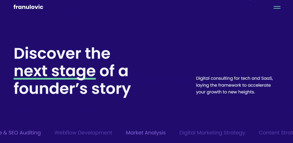
Marino Franulovic, a digital marketing consultant with a Bachelor of Arts degree from Coventry University, presents his expertise through a well-structured portfolio website.
The above-the-fold section features a large heading, a concise bio, and animated text that immediately grabs attention, effectively drawing visitors in. As visitors scroll, subtle float-in effects accompany his service descriptions, which include marketing planning and development, adding a dynamic element that keeps users engaged.
Further down, the site includes a blog post, an About section with contact details, a photo, and client testimonials, providing a comprehensive overview of his experience and building trust with potential clients.
16. Dayla Baron
- Why it’s special: focus on her resume
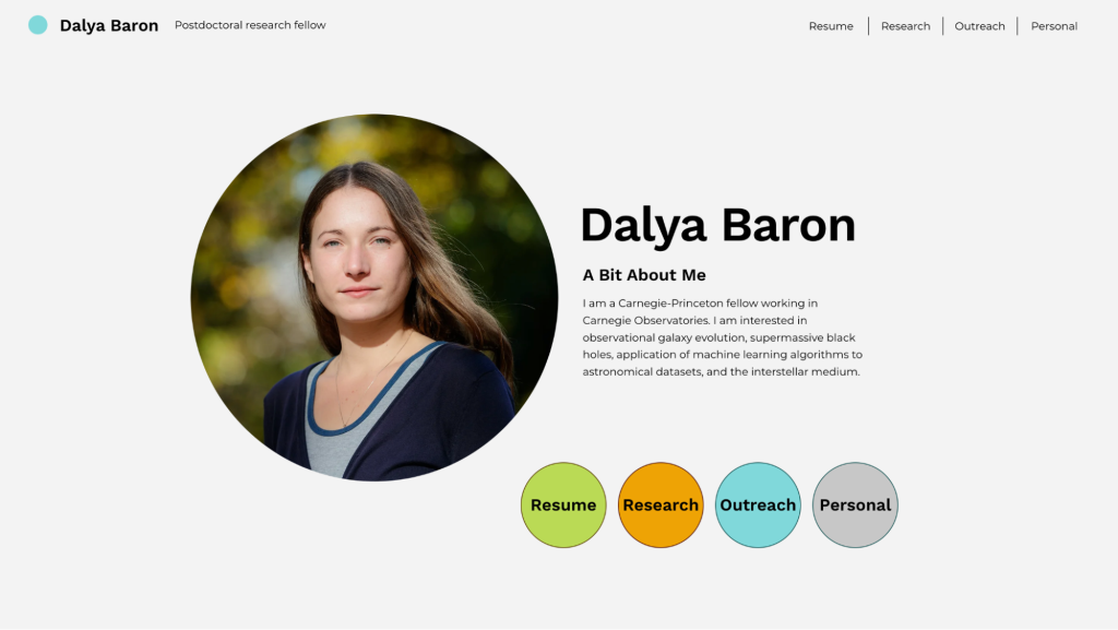
Dayla Baron’s website is an excellent source of inspiration for those looking for resume website examples.
This postdoctoral research fellow keeps the navigation straightforward by displaying four menus on the homepage—Resume, Research, Outreach, and Personal. The menus are also sticky, so visitors don’t need to return to the homepage to find other categories.
On the Resume page, Dayla chronologically lists her education, awards, and publications. The Research page, on the other hand, includes graphics and figures to help readers get a glimpse of her academic papers.
17. Caroline Li
- Why it’s special: dropdown menu
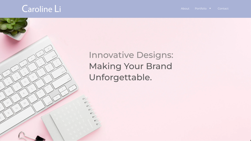
Caroline Li’s website is a well-crafted example of an online portfolio, perfect for creative professionals looking to showcase their work. It effectively uses a dropdown menu in the main navigation bar, linking to individual pages for each portfolio piece.
This setup makes projects easily accessible and allows each one to be presented in detail. The well-organized layout enhances the overall user experience, helping visitors and potential employers better understand Caroline’s core competencies.
18. Kelvin Igweshi
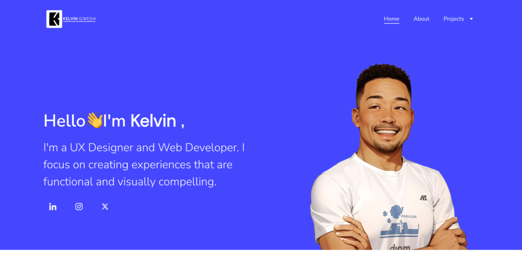
- Why it’s special: clear skills presentation and accessible contact information
This resume website effectively highlights the author’s UX design and web development skills, paired with a concise, professional introduction. The clean layout and straightforward navigation make it easy for visitors to understand the designer’s expertise right from the homepage.
With well-organized sections and accessible contact information, the site provides a user-friendly platform for connecting with potential clients or collaborators.
How to create the best portfolio website
Creating a stunning portfolio website is made simple with Hostinger Website Builder, thanks to its user-friendly interface and AI-powered tools. Here’s a quick guide on how to get started:
1. Sign up and use AI to create a portfolio layout
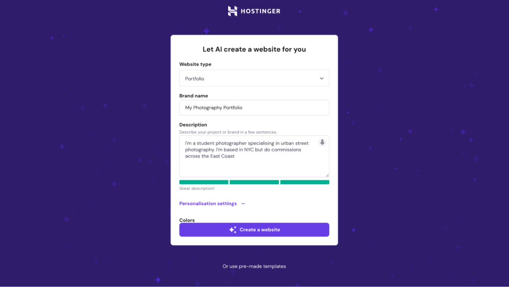
Head to the AI portfolio maker page. Choose a builder plan, pay, and create an account. Next, use AI to create a portfolio design or choose a ready-made portfolio website template that matches your style.
The AI builder suggests a site design based on your profession, whether you’re a designer, photographer, or writer. This saves time and ensures your portfolio aligns with your personal brand.
Simply describe your site and answer a few simple questions, and the tool will create a fully-fledged portfolio site for you.
2. Customize your portfolio website
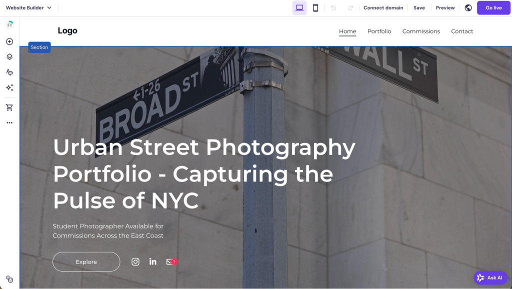
Use the drag-and-drop editor to personalize your site. Simply select any element and place it on the page. The grid ensures that all elements are correctly aligned.
The built-in AI tools help you automatically create content for different sections, like your bio or service descriptions, making it easier to set up your portfolio quickly. The AI Writer, for example, creates unique copy based on a text description.
3. Showcase your work
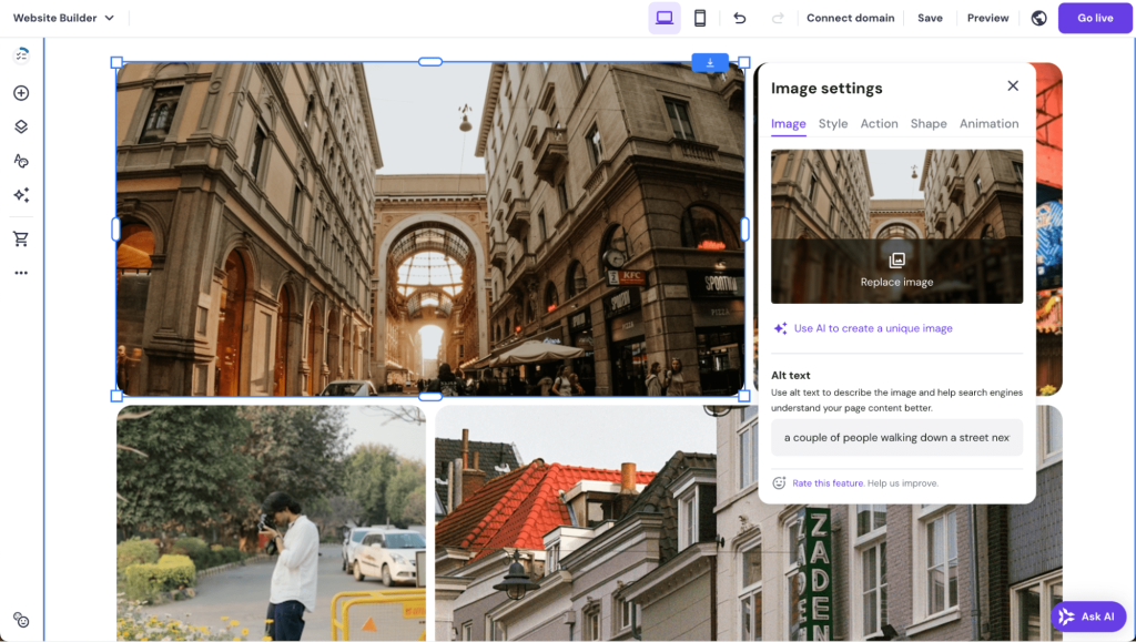
Set up all the main pages that you want to include. For the project and portfolio pages, upload images, videos, and project descriptions to highlight your skills. Organize your portfolio into categories for easy navigation.
4. Add testimonials and contact forms
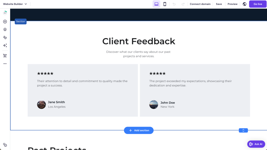
Add a testimonial section to showcase reviews from previous clients. Use the AI Page Generator to create a new page by describing what you want to have on the page.
Remember to include a contact form on your Contact page so potential clients can easily reach out to you.
5. Optimize for search engines
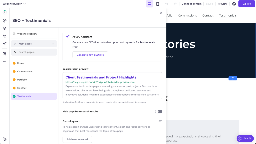
AI-driven SEO tools assist in optimizing your portfolio, boosting its visibility and helping it rank higher on search engines. Follow the AI-powered assistant to ensure each page has a focus keyword, meta title, meta description, and a search engine-friendly URL.
Your site will also be automatically responsive, ensuring it looks great on both desktop and mobile devices.
6. Publish your site
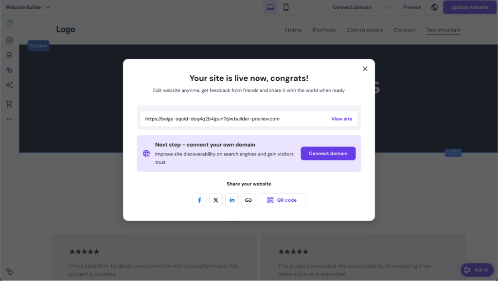
When happy with the result, hit Go live and publish your portfolio site. Then, follow the on-screen instructions to connect a domain to your site.
For a more in-depth guide, follow our tutorial on how to make an online portfolio.
Conclusion
A well-crafted portfolio website is a powerful tool for showcasing your skills and attracting potential clients.
Looking at these 15+ portfolio examples, here’s what you should take from them:
- Prioritize simplicity to make your site easy to navigate and visually appealing.
- Showcase your best work with well-organized project sections and clear descriptions.
- Leverage personal branding by using a consistent design, color scheme, and domain.
- Enhance user experience with subtle animations and dynamic elements.
- Build credibility by adding client testimonials and integrating social media.
With Hostinger Website Builder, creating an impressive portfolio website becomes a streamlined process.
Whether suggesting templates, generating content, or optimizing your site, you can build a portfolio that effectively highlights your talent and personal brand.
Portfolio website FAQ
Is having a portfolio website worth it?
Yes, it showcases your work, enhances your personal brand, and helps attract potential clients or employers. A well-designed portfolio website also sets you apart in competitive industries.
What should you avoid in a portfolio?
Avoid clutter, outdated work, slow-loading pages, and poor navigation that can confuse visitors. Overloading your portfolio with unnecessary details can also overwhelm potential clients.
What should be in a portfolio website?
Include an introduction, examples of your best work, testimonials, a contact form, and a clear call to action. For step-by-step guidance on creating a specialized portfolio, check out our articles on how to make a digital art portfolio and how to make a graphic design portfolio.
Can I create a free online portfolio?
Yes, several platforms offer free options for creating online portfolios. While these free tools are a great starting point for beginners, they are often limited in features.


Comments
November 04 2023
I want my firm portfolio launch
November 09 2023
Hello there! Creating a professional website is a great way to launch your firm's portfolio! It provides a platform to showcase your work and attract potential clients. If you need assistance, feel free to contact our Customer Success Team ?
February 02 2024
i wound like to no more about portfolio website because am still a biginer in the programming world
February 07 2024
Hi Charles! Sure thing. You might find our collection of art portfolio website examples helpful for inspiration. It features a variety of stunning portfolios that can give you ideas and insights into designing your own. Take a look and see what resonates with you ?