Top 16 Wellness Website Examples
A health and wellness website is a great way to grow your wellness brand online. Whether you focus on beauty and wellness services, healthy foods, or online coaching and counseling services, a website helps you reach a wider global audience.
In this article, we will look at some of the best wellness websites built with Hostinger Website Builder. We will also share some tips on what all the top wellness websites have in common and answer some of the most frequently asked questions.
Download checklist: How to start an online business
16 Best Wellness Website Examples
Below you’ll find 16 health and wellness websites, all built with Hostinger Website Builder, that you can use as inspiration for your own wellness site.
1. Karen Lee Wellness
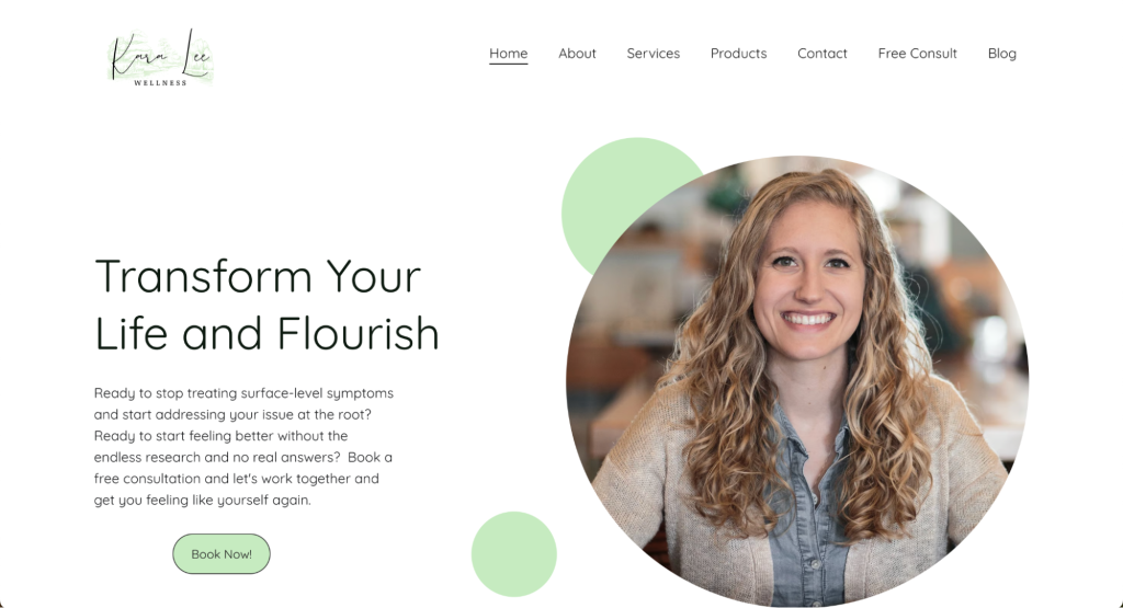
Kara Lee Wellness is a holistic health website offering nutrition counseling and services to address root health issues.
The site features lots of informative blog posts, free wellness handouts, and client testimonials, which build credibility with the site visitors. These free resources help educate and support clients on their wellness journey and can be used as teasers of what the paid services entail.
To emulate this, create high-quality, relevant content for your audience, include free downloadable resources, and showcase client testimonials to build trust and offer practical value to the visitors.
With Hostinger Website Builder’s media library, you can easily upload and manage various resources on your website. Consider adding an online store to your health and wellness website from £3.79/month and make money by selling downloadable content.
2. Kora Day Wellness Spa
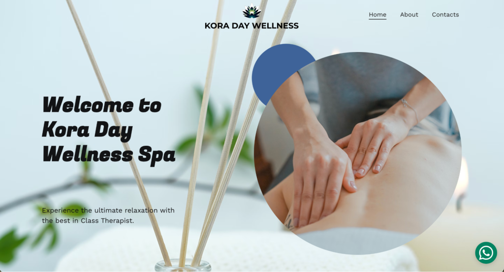
Kora Day Wellness Spa is a luxury spa offering premium massage services to rejuvenate the body and mind.
The website’s sophisticated and serene color palette, featuring muted tones and nature-inspired accents, creates a tranquil atmosphere when users land on the homepage. This wellness website design incorporates high-quality images of the spa environment, which enhances the sense of relaxation and luxury.
To replicate this, use calming color schemes and professional, high-resolution images that reflect your wellness services and ambiance.
This health and wellness website also features a clean and intuitive layout, ensuring easy navigation. Clear menus and well-organized page sections help users quickly find information about services and pricing. Design your website with user experience in mind, prioritizing a straightforward and logical page structure that makes it easy for visitors to explore what you offer.
3. Mantra2Wellness
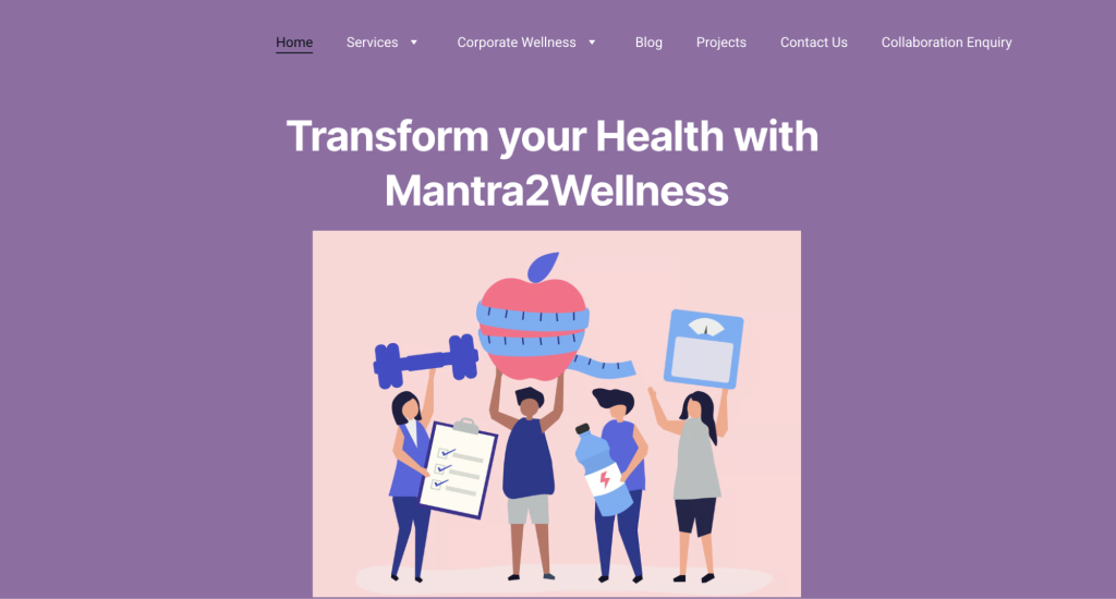
Mantra2Wellness is a healthcare and wellness website offering a variety of services, including physical therapy, nutrition, fitness, and corporate wellness programs.
As wellness websites go, Mantra2Wellness offers comprehensive care for different types of clients. The dropdown menus in the top navigation menu allow visitors to access all the different services, helping ensure easy navigation for them.
To replicate this, create dropdown menus to easily categorize the different services available in your main menu. This way, you guide the visitors to the right pages on your site without overwhelming them with choice.
Mantra2Wellness also emphasizes community engagement through educational content, such as webinars, health talks, and wellness blog posts. These resources help educate and support clients on their wellness journey. Consider creating engaging educational content and fostering a sense of community through interactive and informative content on your website.
4. Mobiles Wellness Center
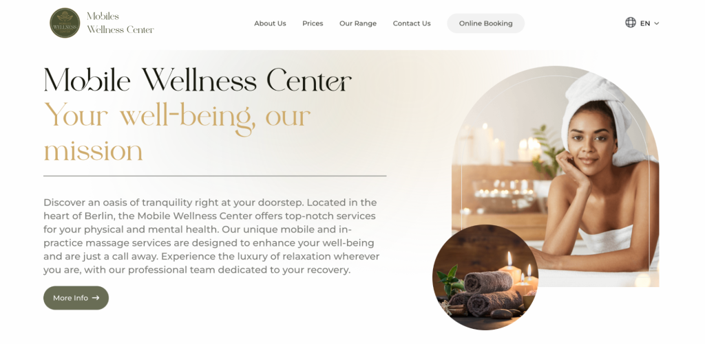
Mobiles Wellness Center is a premium mobile and practice-based massage service in Berlin, Germany, designed to deliver relaxation and therapeutic massages to various locations.
The website has a luxurious feel with a sophisticated color palette and high-quality imagery, reflecting an upscale and serene experience. The design elements, including elegant fonts and refined layouts, contribute to a sense of opulence and tranquility.
To replicate this, use premium design elements such as elegant typography, high-resolution images, and a cohesive color scheme that conveys luxury and sophistication. In Hostinger Website Builder, the color palette and typography are easily adjustable using the main site editing interface, meaning you can experiment with different styles before you publish your site.
5. Ramos Wellness
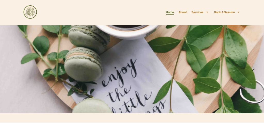
Ramos Wellness is a comprehensive healthcare service focusing on various therapies and treatments for conditions such as vertigo, sciatica pain, and scoliosis.
This health and wellness brand effectively utilizes customer testimonials to build credibility and trust. Detailed accounts from satisfied clients highlight the effectiveness of the treatments and the positive impact on their lives.
To reproduce this, gather and display detailed testimonials from your clients. Encourage them to share specific outcomes and improvements, helping potential clients understand the benefits of your services and build trust in your brand.
6. Ravintasara Wellness Hotel
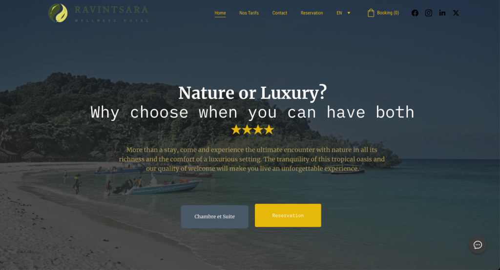
Ravintsara Wellness Hotel, located on the west coast of Madagascar, is a luxurious, nature-integrated retreat. This resort combines the tranquility of tropical surroundings with high-end amenities.
The hero section of the Ravintsara Wellness Hotel website is a great example of web design best practices. The headline immediately captures the visitor’s attention and sets the tone for the site.
The prominent button placement provides clear, actionable steps for visitors, guiding them effortlessly toward booking or exploring room options. This ensures that visitors can quickly engage with the most important aspects of the website.
7. SerenityMed Wellness Clinic
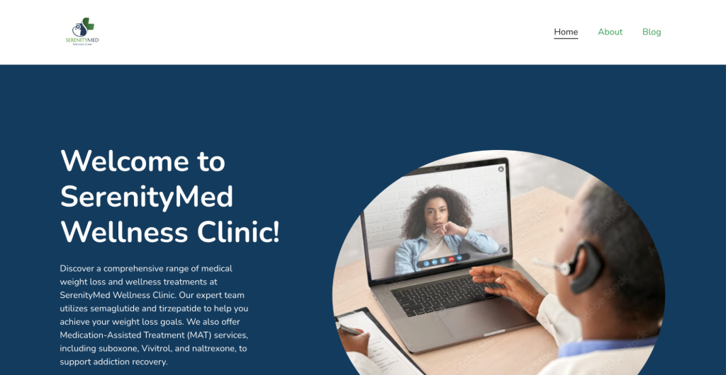
The site provides an in-depth overview of Dr. Erica Bolar’s extensive qualifications and professional background, including her educational achievements and over 15 years of diverse healthcare experience.
An extensive About page like this builds credibility and trust, which are crucial in the wellness industry. Consider having detailed and personal introductions of your key team members, highlighting their expertise and dedication to client care.
The site also emphasizes Dr. Bolar’s compassionate approach and exceptional communication skills, ensuring patients feel heard and understood. Personal touches like these create a welcoming and trustworthy atmosphere.
8. Seventh Hand Wellness
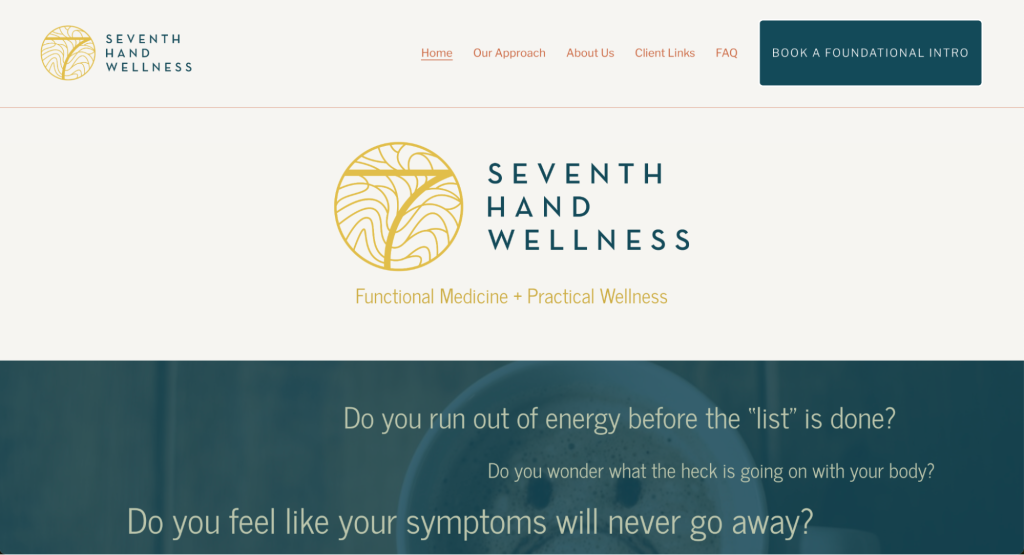
Seventh Hand Wellness is a functional medicine practice offering virtual consultations to holistically address various health issues.
The homepage of this health and wellness website immediately connects with visitors by addressing common health concerns and emphasizing a personalized approach. The use of direct questions engages the reader and shows empathy.
To replicate this, use relatable and direct language that speaks to your audience’s concerns and highlights your commitment to finding personalized solutions.
The site also prominently features clear call-to-action (CTA) buttons to schedule a foundational introduction, making it easy for visitors to take the next step.
For a similar effect, ensure you have clear, prominent CTAs both in your menu and throughout the page design. Use Hostinger Website Builder’s built-in heatmap tool to understand the optimal placement for these important page elements.
9. The Wellness Room
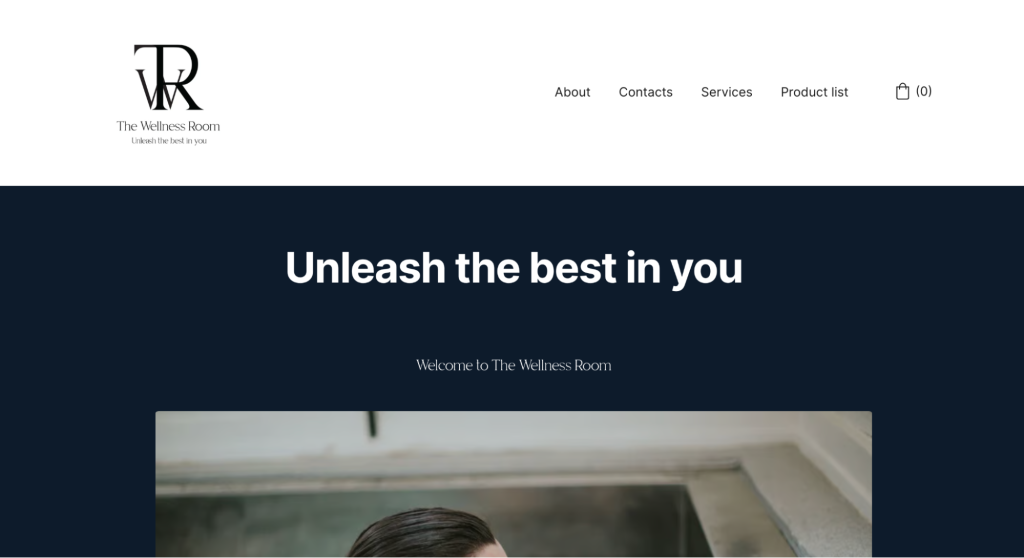
The Wellness Room is a modern wellness center focusing on biohacking and personalized wellness services while using state-of-the-art equipment. The brand’s homepage has a clean and structured layout, which is crucial for engaging and guiding visitors effectively.
The layout’s use of distinct sections and white space enhances readability and focus. This makes it easier for users to absorb information while establishing a visual hierarchy that guides visitors through content logically.
A clean, structured design also conveys professionalism and reliability, which are essential for building trust with your audience. Adopting a similar layout ensures that your website is both user-friendly and aesthetically pleasing.
10. Jen Brighty Grief Coach
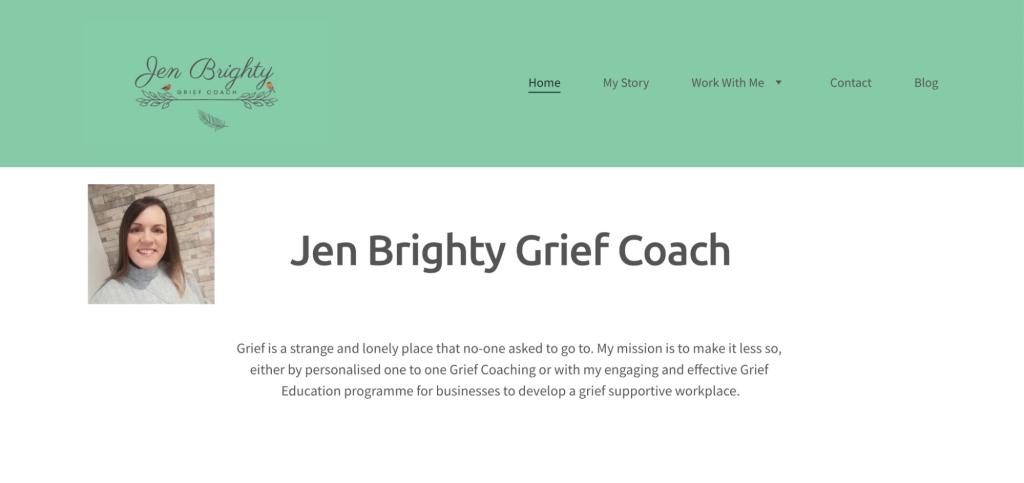
Jen Brighty offers personalized grief coaching and corporate grief education to support individuals and organizations in developing a compassionate approach to grief.
Her website uses a calming and soothing color palette with soft blues and greens, which creates a peaceful and supportive atmosphere for visitors dealing with grief. Depending on your wellness niche, choose colors that evoke the feelings you wish your health and wellness website to be associated with.
The content is centered around empathy, offering personalized coaching services and educational resources for grief. These address the specific needs of those seeking support and provide clear information about the services offered. To recreate this on your site, ensure your content directly addresses the concerns and needs of your audience.
Use Hostinger Website Builder’s AI Writer to streamline the content creation process. Explain the type of content you want to have, and the AI will create a first draft of unique copy for you.
11. Fig Life Wellness
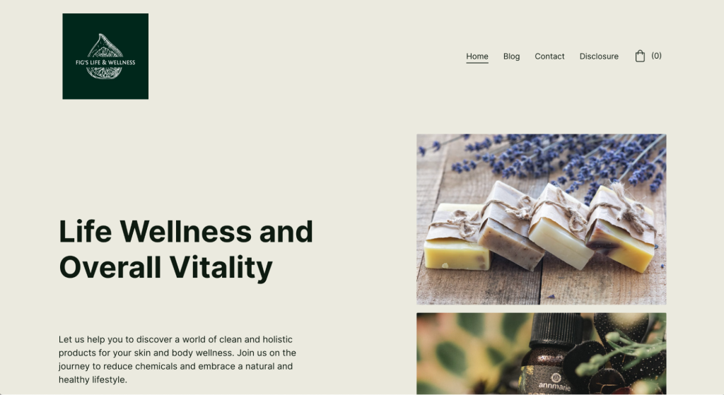
Fig Life Wellness sells clean and holistic products for skin and body wellness, emphasizing natural ingredients and chemical reduction.
The blog on Fig Life Wellness provides well-researched articles on various wellness topics, such as holistic wellness, skin health, and nutrition, enhancing the site’s credibility and engaging users with relevant content. Each post offers practical advice and insights that visitors can apply to their lives.
Maintaining an informative blog can establish authority in the wellness niche and keep visitors returning for valuable information. Adding a blog to your Hostinger Website Builder wellness website design is easy: simply open the blog settings from the side menu, and click on Start a blog to begin.
12. Fearless Wolf Life Coaching
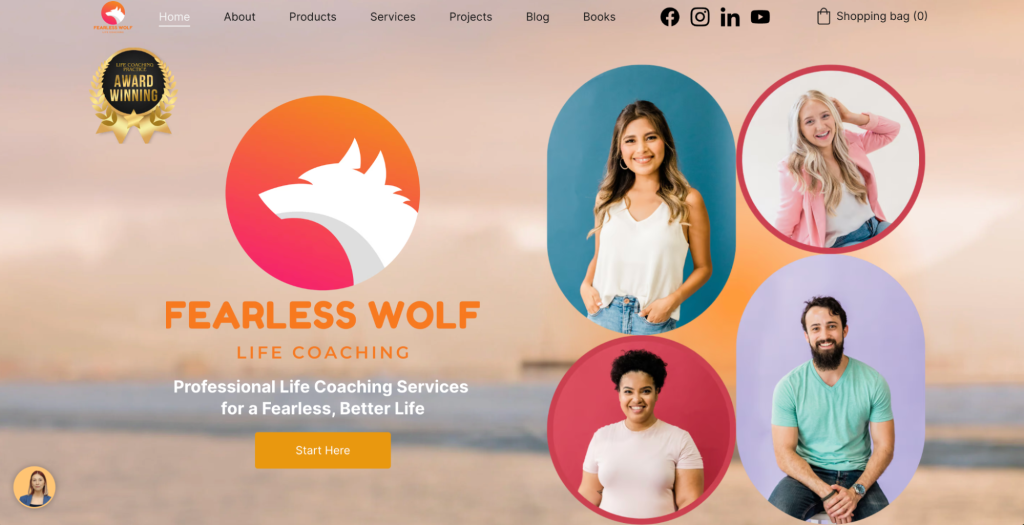
Fearless Wolf Life Coaching provides life coaching services focused on personal, professional, and spiritual development.
Overall, Fearless Wolf Life Coaching has a strong visual identity with a consistent theme that reflects the brand’s ethos of courage and personal growth. The wolf imagery and consistent use of branding elements create a memorable impression.
Aim to develop a cohesive brand identity for your health and wellness website that resonates with your target audience and reinforces your message.
This health and wellness website also includes interactive features such as contact forms and scheduling options, making it easy for potential clients to reach out and book appointments. Consider incorporating interactive elements on your site for a similar effect – this can significantly enhance user engagement and streamline client interactions.
13. LuluFit Coaching
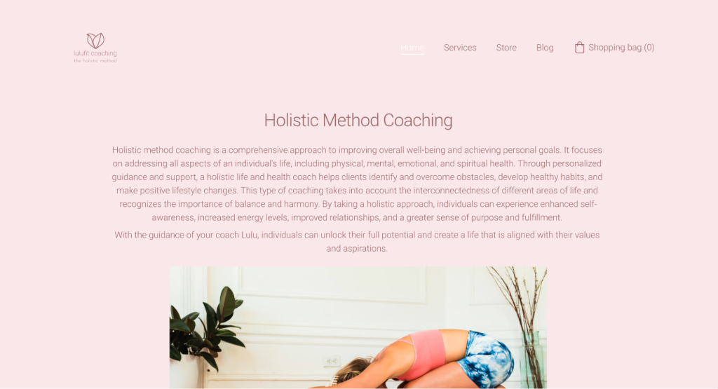
LuluFit Coaching focuses on empowering women through a holistic approach to wellness, offering personal training, nutrition guidance, and life coaching services in NYC.
The brand’s website uses a vibrant and inviting color scheme that exudes energy and positivity, perfectly aligning with its focus on empowering women through fitness and wellness. Bright, uplifting colors can make a website feel more engaging and approachable. Selecting a color palette that reflects the energy of your brand is crucial in making a strong first impression.
This health and wellness website also prominently features client testimonials and success stories, which build credibility and trust. This client-centered approach showcases the effectiveness of the services and the positive impact on clients’ lives.
Consider incorporating testimonials and similar personal success stories. Real-life proof can significantly improve the credibility of your wellness website and attract potential clients.
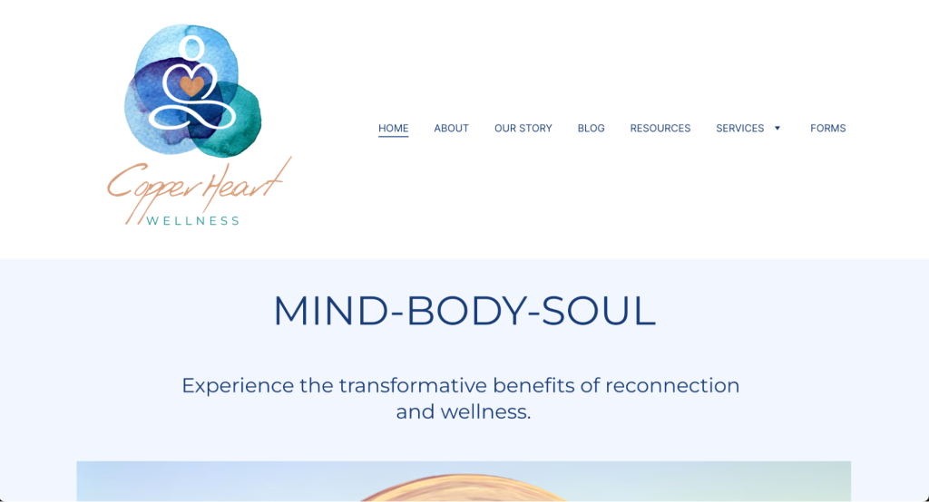
14. Copper Heart Wellness
Copper Heart Wellness is a holistic wellness website offering services ranging from nature and forest therapy to reiki and breath work.
The website design builds trust by including service providers’ credentials and testimonials from clients in the homepage design. This is vital for attracting and retaining clients in the long run. Ensure that you highlight your professional qualifications and positive client feedback on your wellness site to show that your brand is professional and trustworthy.
The site also has intuitive navigation and detailed service descriptions, making it easy for visitors to find and understand the services provided. This user-friendly approach ensures that information is accessible and engaging. Focusing on clear navigation and informative content is essential for an effective wellness website that both looks good and functions well.
15. Cultivate Wellness
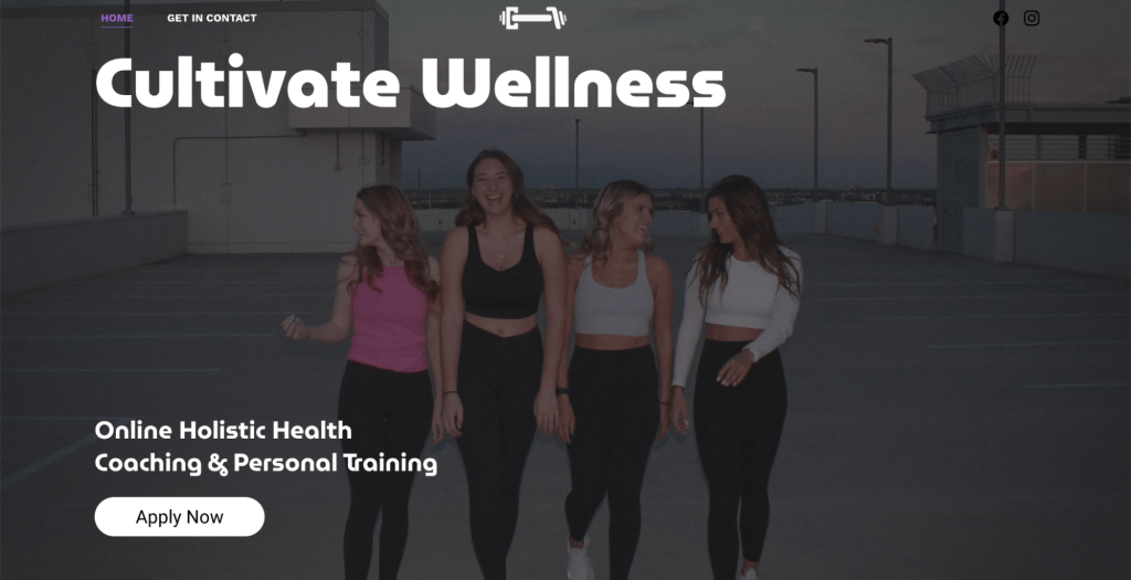
Cultivate Wellness is a site revolving around personalized fitness and wellness coaching, focusing on a holistic approach to health. The site provides custom-tailored workouts, guidance, and mental health support.
The website effectively uses vibrant visuals and a sectioned layout to highlight the available services. High-quality images of personalized workouts, group activities, and wellness guidance create an engaging and dynamic atmosphere. To replicate this, use compelling images and a clear layout to make each section of your site visually appealing and informative.
Featuring a dedicated section for Coach Aleya, the site provides a personal touch with a detailed bio and professional journey. This builds trust and connection with visitors. For a similar effect, consider including a personalized introduction to create a stronger bond with your audience, especially if you plan on building a community around your health and wellness website.
16. Believe Therapy
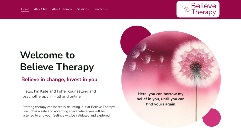
Believe Therapy offers counseling and psychotherapy services in Hull, focusing on providing a safe and supportive environment for clients to explore their mental health concerns.
The Believe Therapy website is designed with user experience in mind, featuring easy navigation and clearly labeled sections. Visitors can effortlessly find information about services, the therapist, and how to get started with therapy.
The site places a strong emphasis on the client’s journey, with dedicated sections and pages explaining what to expect in therapy and how to prepare for sessions.
This client-centric approach helps explain the therapy process and makes potential clients feel more comfortable and informed. Consider adopting a similar client-focused perspective to improve engagement and trust on your health and wellness website.
What Makes a Great Wellness Website
Creating a standout wellness website involves focusing on specific design and content elements tailored to the wellness niche. Below are some of the key factors to consider.
Calming Aesthetic
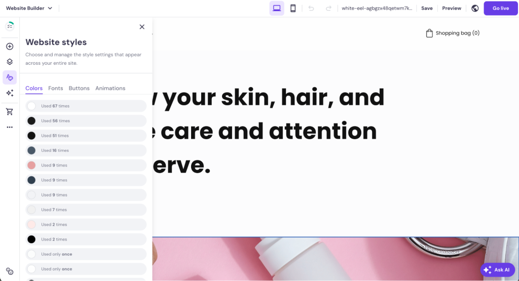
Use soothing color palettes, such as greens, blues, and earthy tones, to create a tranquil atmosphere. Incorporate nature-inspired images and graphics to enhance the calming effect.
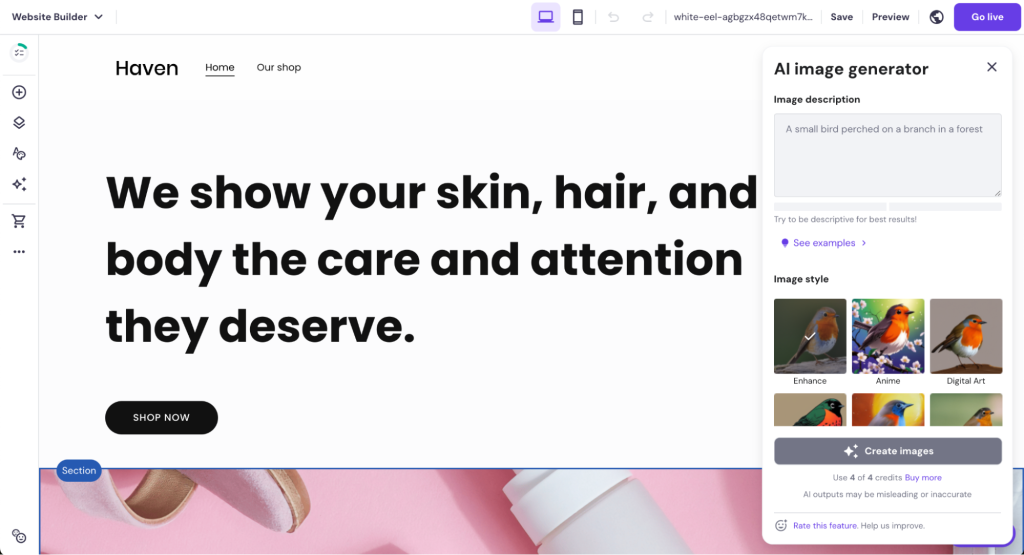
Hostinger Website Builder has a built-in AI Image Generator tool to speed up the process of creating unique visuals for your landing pages. Describe the type of image you need, and the AI will create a bespoke picture. Use the drag-and-drop editor to adjust your images to fit your site’s overall design easily.
Holistic, Engaging Content
Provide a wide range of content that covers various aspects of wellness, including mental health, physical fitness, nutrition, and mindfulness.
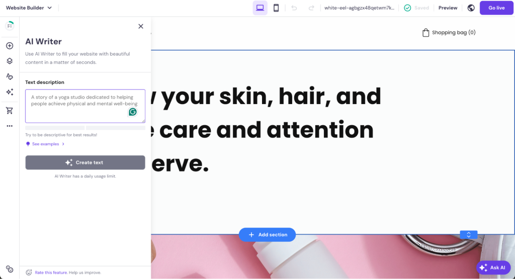
With Hostinger Website Builder, it’s easy to incorporate a blog into your website. Use Hostinger’s AI Writer to create unique, SEO-friendly content to serve as the first draft of your article.

Wellness Resources
Offer downloadable resources such as meal plans, workout schedules, and mindfulness exercises.
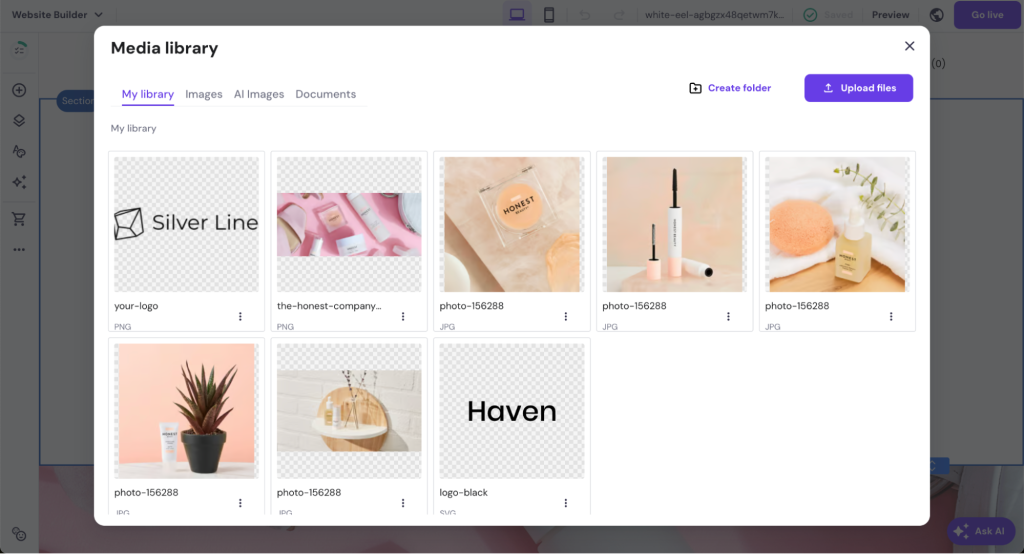
Use Hostinger Website Builder’s media library to upload and manage these resources easily. Create a dedicated section or page for these downloads, ensuring they are easy for visitors to find and access.
Community and Expert Engagement
Create a sense of community by including forums, discussion boards, and social media integration.
Encourage user interaction and support among visitors. Feature content from wellness experts, such as nutritionists, personal trainers, and mental health professionals, to add credibility and value to your site.
Conclusion
The best wellness websites incorporate calming aesthetics, engaging and holistic content, and user-friendly layouts. They emphasize personalized services, community engagement, and clear calls-to-action.
For instance, Kara Lee Wellness excels with its holistic health approach and informative content, while Kora Day Wellness Spa creates a luxurious and serene user experience, and Mantra2Wellness provides comprehensive and easily navigable services.
By studying these examples, you should now know how to create a wellness website that effectively connects with and supports your audience.
Wellness Website Examples FAQ
Find answers to some of the most common questions about wellness websites below.
What Is a Wellness Website?
A wellness website is a website dedicated to promoting health and well-being. It typically offers resources, services, and information on various aspects of wellness, such as physical fitness, mental health, nutrition, and lifestyle improvement.
What Features Should a Wellness Website Have?
A wellness website should have a user-friendly design, engaging content, visual appeal, interactive features, testimonials, effective CTAs, and it should be mobile-responsive for best user experience.
How Do I Create a Visually Appealing and Professional Wellness Website?
To create a visually appealing and professional wellness website, focus on clean and intuitive design, use high-quality visuals, provide valuable and engaging content, incorporate interactive features to the web design, and ensure the site is optimized for search engines. Use AI-powered tools like Hostinger Website Builder to get your wellness website up and running in no time.

