Charity website examples for 2025: Design and feature insights
Creating a charity website that stands out involves more than just good looks – it’s about functionality that drives action. A well-designed site should not only catch the eye but also motivate visitors to get involved.
This article showcases 18 standout charity website examples for 2025, all built using Hostinger Website Builder. Each example demonstrates how to use the built-in tools to create effective, visually appealing charity websites that inspire donations, increase volunteer sign-ups, and raise awareness.
These charity website examples will show you how to structure, design, and implement essential features, helping you create impactful and user-friendly nonprofit websites.
Top 18 charity website examples
With Hostinger Website Builder’s user-friendly drag-and-drop interface, customizable non-profit website templates, and integrated donation systems, creating a professional charity website is easy for everyone, regardless of their technical expertise.
The following real-life examples illustrate how to combine creativity with purpose, ensuring your charity’s message and goals are clear and convincing.
1. Turning Corners
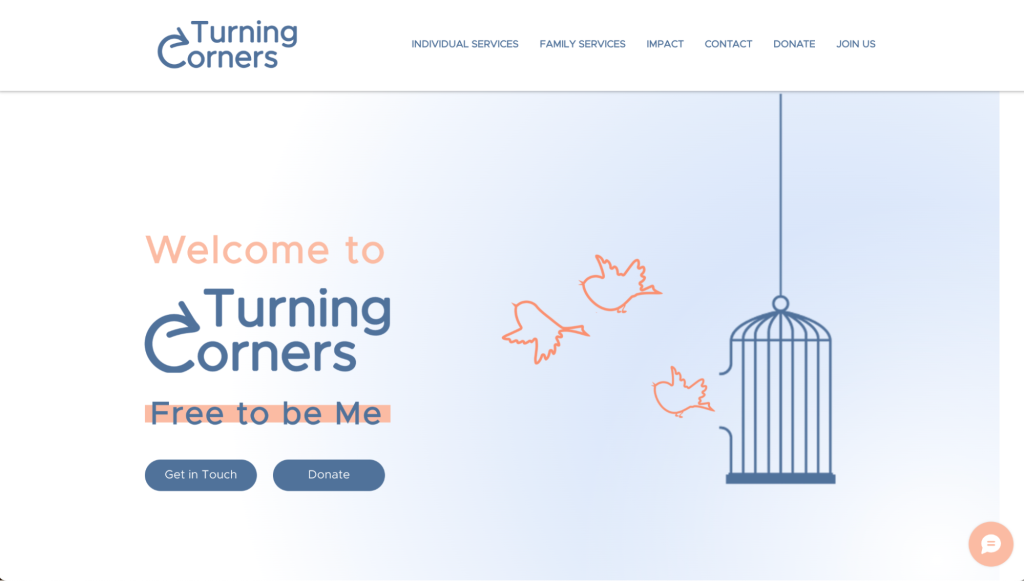
Turning Corners’ homepage is a compelling example of how a charity website can immediately engage visitors and clearly communicate its mission.
The homepage features a powerful hero section (the large, eye-catching area at the top of the webpage) with an impactful headline, call-to-action (CTA) buttons, and a background image that conveys the charity’s focus. This is followed by concise sections highlighting the organization’s programs, success stories, and ways to get involved, creating a smooth flow of information.
The use of visually distinct CTA buttons, such as Donate, makes it easy for visitors to take immediate action. Strategically placing them on the hero section of the web page helps ensure all potential donors notice them.
2. Art4Charity
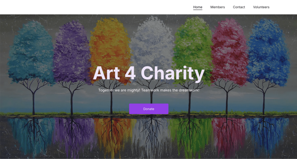
Art 4 Charity’s Members page serves as an excellent example of how to build trust and authenticity on a charity website.
This page provides a visually appealing layout that showcases the team members and supporters who contribute to the organization. Each profile includes a photo, name, and brief description, creating a personal connection with visitors and emphasizing transparency.
Foster credibility by highlighting the real people behind the charity in a similar manner. This will make it easier for potential donors and volunteers to trust and engage with your cause.
3. Ilham Charity
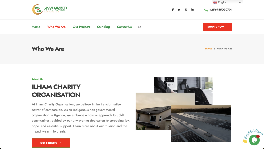
Ilham Charity’s Who We Are page is another great example of effectively communicating an organization’s mission and values on a charity website.
The page provides a clear and concise overview of the organization’s purpose, which helps visitors quickly understand what Ilham Charity stands for and the impact it aims to achieve.
The clean and structured layout visually organizes the different sections into bite-sized chunks. This level of transparency builds trust with potential donors, volunteers, and partners.
Use Hostinger Website Builder’s AI Heatmap tool to check which parts of your design interest visitors the most, and adjust the page layout accordingly.
4. Charity Deeds
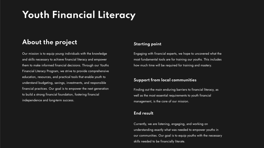
The Youth Financial Literacy Project page on the Charity Deeds website is a great example of how to present a specific project in a clear and engaging way.
This page provides a detailed overview of the project’s goals, activities, and impact, using a combination of concise text and relevant images.
It effectively communicates the importance of financial literacy for youth, outlining how the project addresses this need.
Consider adding individual pages to your charity site to showcase your organization’s impact on the community. This can help attract more donations and build trust with the general public.
5. Arts Nonprofit
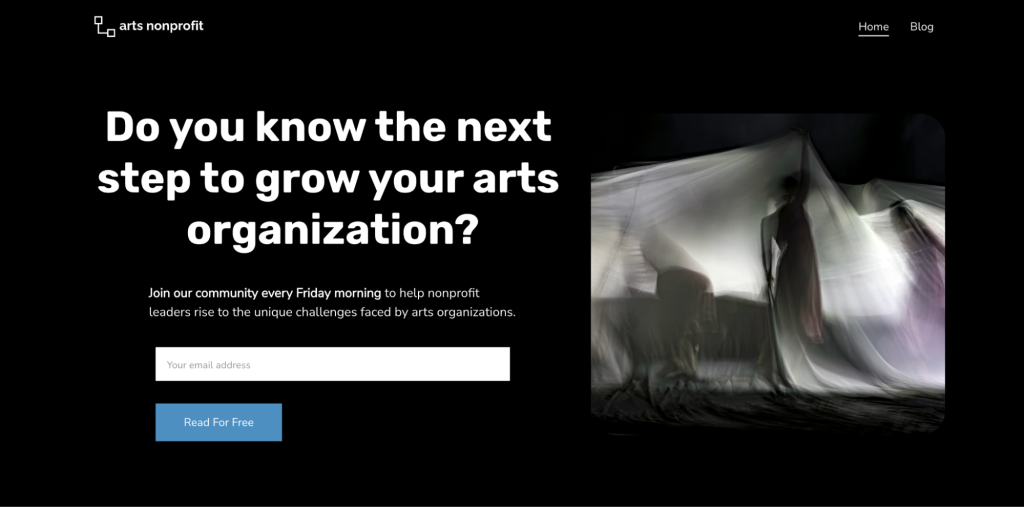
The newsletter signup section on the Arts Nonprofit homepage is a prime example of how newsletters can effectively engage visitors and build a community of supporters.
Positioned strategically on the homepage, this section invites visitors to stay connected by subscribing to the newsletter. The clean design, concise copy, and visible call-to-action button make it easy for users to sign up without being overwhelmed by unnecessary information.
By promising updates on upcoming events, projects, and ways to get involved, the signup form serves as a valuable tool for maintaining ongoing engagement.
6. Athletes for Children
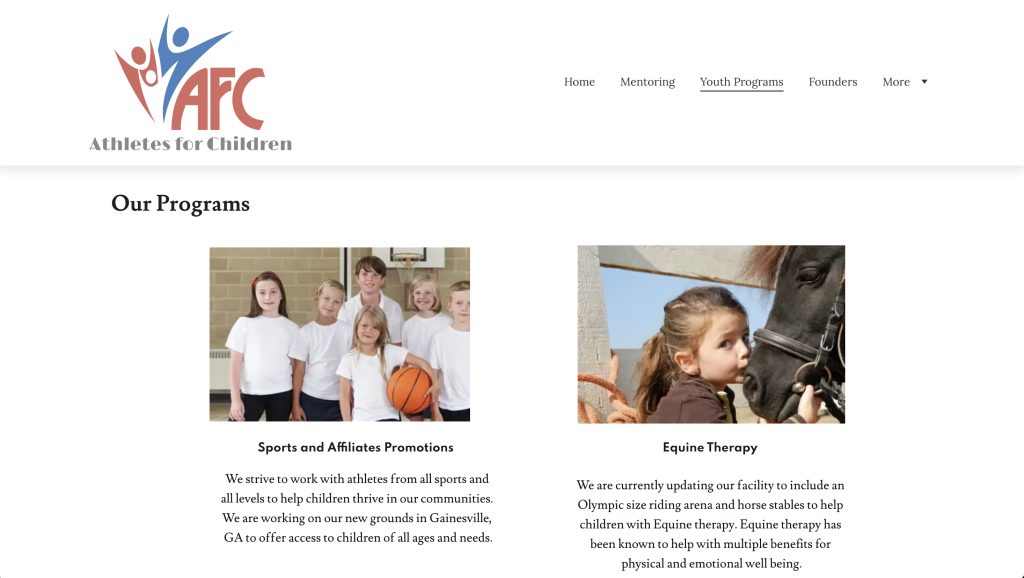
The Youth Programs page on the Athletes for Children website is a great example of how a charity can effectively showcase its programs to attract support and participation.
This page is organized to provide detailed information about various youth programs offered by the charity, including descriptions of each program’s goals, activities, and impact.
By breaking down each program into easily digestible sections, visitors can quickly understand the specific initiatives they may want to support or get involved with.
This structure highlights the different available initiatives and lets potential donors and volunteers find programs that resonate with their interests. In Hostinger Website Builder, use the AI Writer to quickly create engaging descriptions if you’re struggling with writer’s block.
7. Myanmar Children and Family Medical Foundation
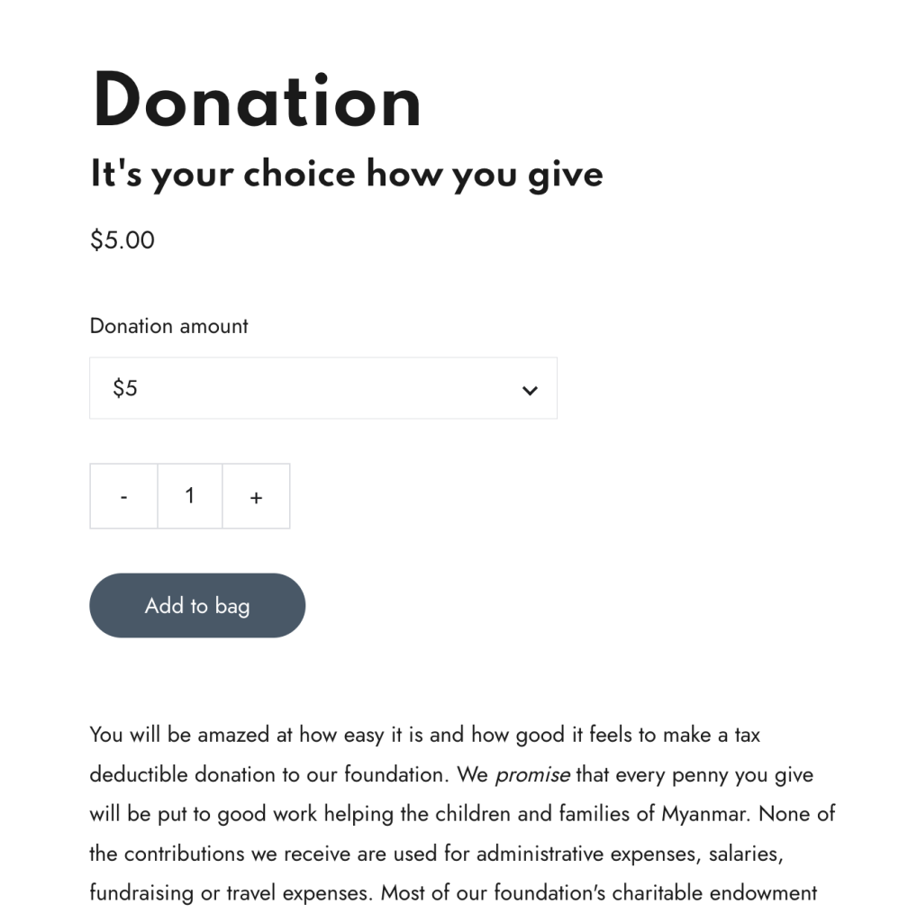
The Donation page on the Myanmar Children and Family Medical Foundation website is a strong example of how integrating eCommerce functionality directly into a charity site can significantly improve fundraising efforts.
This page lets visitors make direct donations through the charity website. This ease of use, coupled with clear instructions and suggested amounts, reduces friction and encourages immediate support.
Hostinger Website Builder makes it easy to accept online donations directly from your charity website. Simply add an online store to your website and include donations as part of your store’s products.
8. SSG Charity
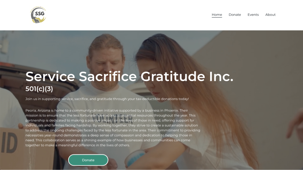
The hero section on the SSG Charity homepage is a compelling example of how a dynamic visual element can immediately engage visitors and effectively communicate the organization’s mission.
This section features a high-quality video that plays automatically when users land on the page, providing a captivating introduction to the charity’s work. The video hero format is highly effective because it quickly conveys the impact and emotion behind your organization’s cause, creating a strong first impression.
Consider using a video hero section to showcase real success stories, fieldwork, and other beneficiary impact in a way that static images or text can’t communicate as effectively.

9. Cards 4 Cancer
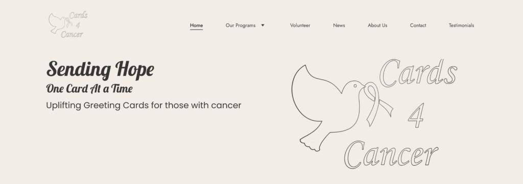
Cards 4 Cancer Patients is a charity that creates and delivers personalized, handmade cards to cancer patients to provide emotional support, encouragement, and hope during their illness.
The Volunteer page on the charity’s website is an excellent example of effectively engaging potential supporters by providing clear pathways to get involved.
This page outlines various volunteer opportunities, detailing how individuals can contribute to the cause. With concise descriptions and a straightforward layout, the page makes it easy for visitors to understand how they can help, whether through card-making, event support, or outreach activities.
For maximum impact, consider including a simple volunteer sign-up form to further streamline the process and encourage immediate action from interested visitors.
10. Recycle 2 Restore
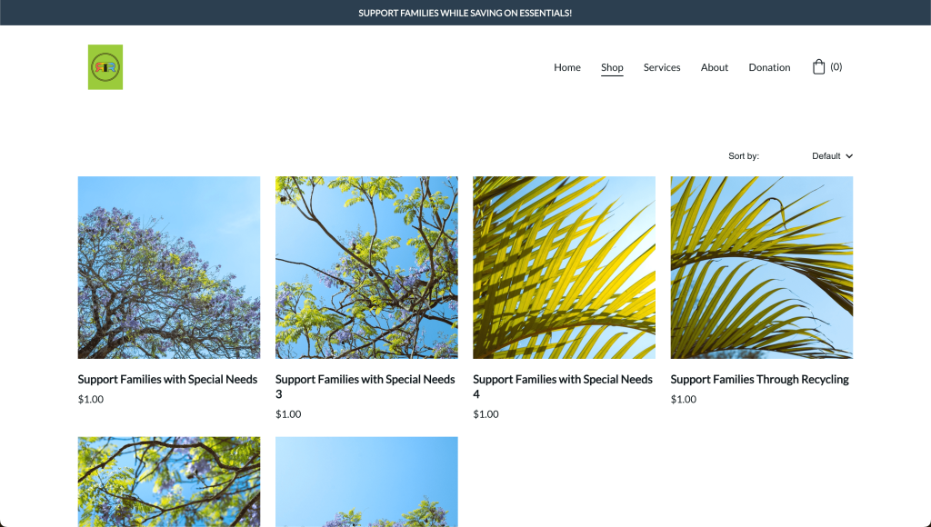
The Shop functionality on the Recycle 2 Restore website is a great example of how charities can integrate eCommerce to support their fundraising efforts. The shop page is designed to let visitors donate directly to support families with special needs or local recycling initiatives.
The layout is clean and straightforward, making it easy for visitors to browse the different options. Each item is accompanied by a title, image, and price, making it easy for visitors to browse and choose how they want to contribute.
Having a shop section on a charity website is valuable as it provides an additional revenue stream while engaging supporters.
11. Rex Runs Kindly
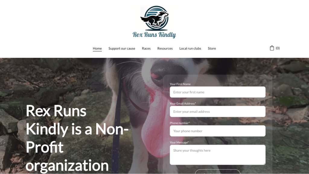
The contact form on the Rex Runs Kindly homepage is an excellent example of how to create an accessible and effective communication channel for visitors.
The form, prominently placed on the homepage, lets users easily contact the charity with inquiries, requests for more information, or expressions of interest in volunteering or partnering.
Its straightforward design, with fields for name, email, and message, makes it user-friendly and encourages more visitor engagement.
Adding the contact form element to your site is intuitive with Hostinger Website Builder – simply drag and drop the block to your desired spot on a page, customize the fields, and you’re ready to go.
12. J-1st Ministries
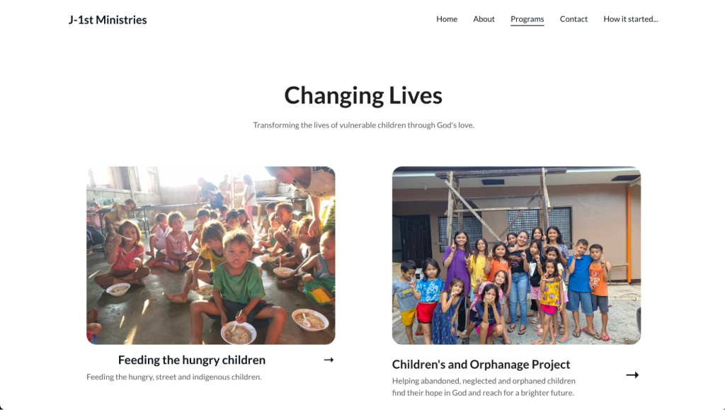
The Programs page on the J-1st Ministries website is a good example of an effective layout for showcasing various initiatives on a charity website.
The page uses a clean, two-column layout that visually separates different programs, each with an accompanying image and a concise description.
This structured format ensures that visitors can easily navigate and understand how the organization is making an impact, such as Feeding the Hungry Children and the Children’s and Orphanage Project.
The use of high-quality, authentic images adds a personal touch, helping the visitors to emotionally connect with each program.
13. New Lenox Cancer Fund
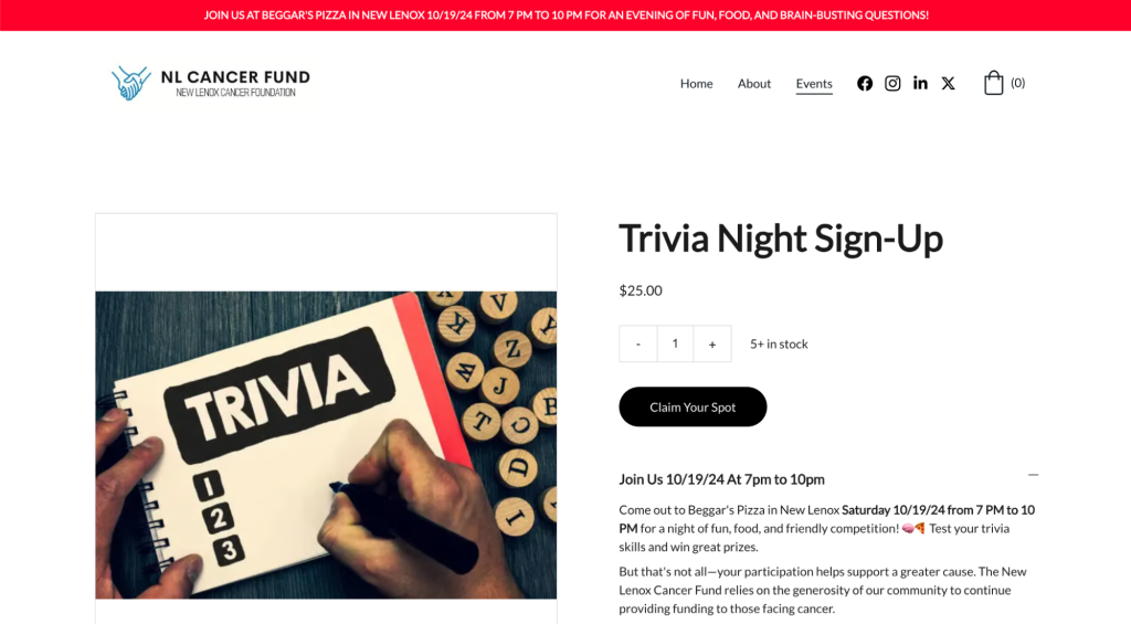
Running community events like trivia nights is a powerful fundraising strategy. It fosters a sense of community and provides an interactive way for supporters to contribute.
By incorporating an online store to sell tickets to these events, charities make it easy for attendees to secure their spots, reducing friction and encouraging higher participation.
The Event page on the New Lenox Cancer Fund website is a great example of how charities can effectively use community events to engage supporters and raise funds.
This page not only provides detailed information about the upcoming trivia night, including the rules, location, and schedule, but it also integrates an online store for purchasing tickets directly. This combination of event promotion and eCommerce functionality makes it simple for visitors to support the cause by participating in a fun community event.
14. Leaning Crown
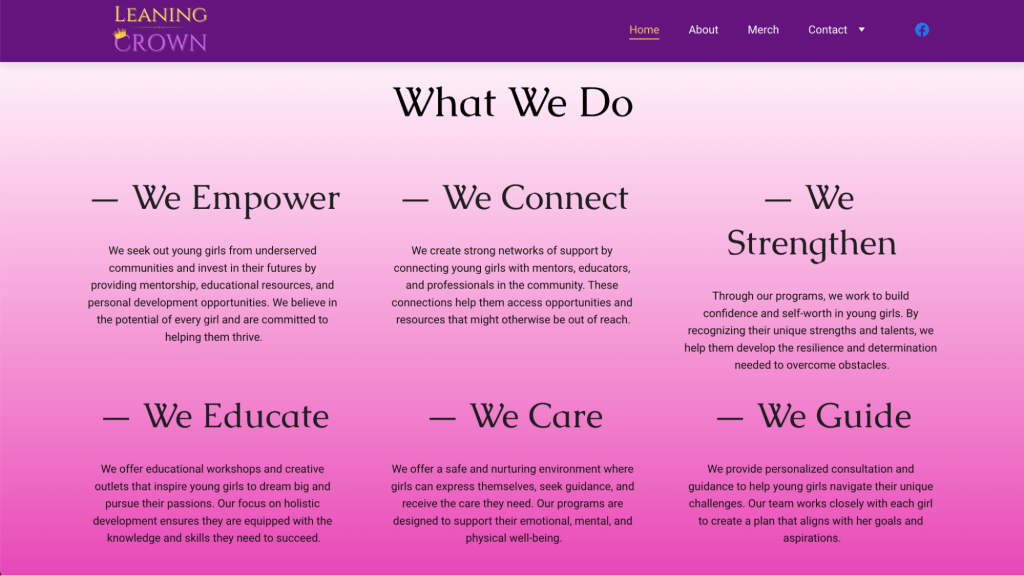
The What We Do section on the Leaning Crown website is a powerful and visually appealing way to communicate the organization’s mission and core activities on the homepage.
The section is organized into a three-column grid that clearly separates each of the six pillars of the organization: Empower, Connect, Strengthen, Educate, Care, and Guide. Each pillar has a bold heading, a brief description, and a consistent style that creates a cohesive and professional look.
This layout is highly effective because it breaks down complex information into digestible chunks, making it easier for visitors to understand the span of the charity’s work. The use of concise, impactful language helps to convey the organization’s values and initiatives quickly, while the visual separation ensures that each focus area stands out.
15. Volunteer for Autistics
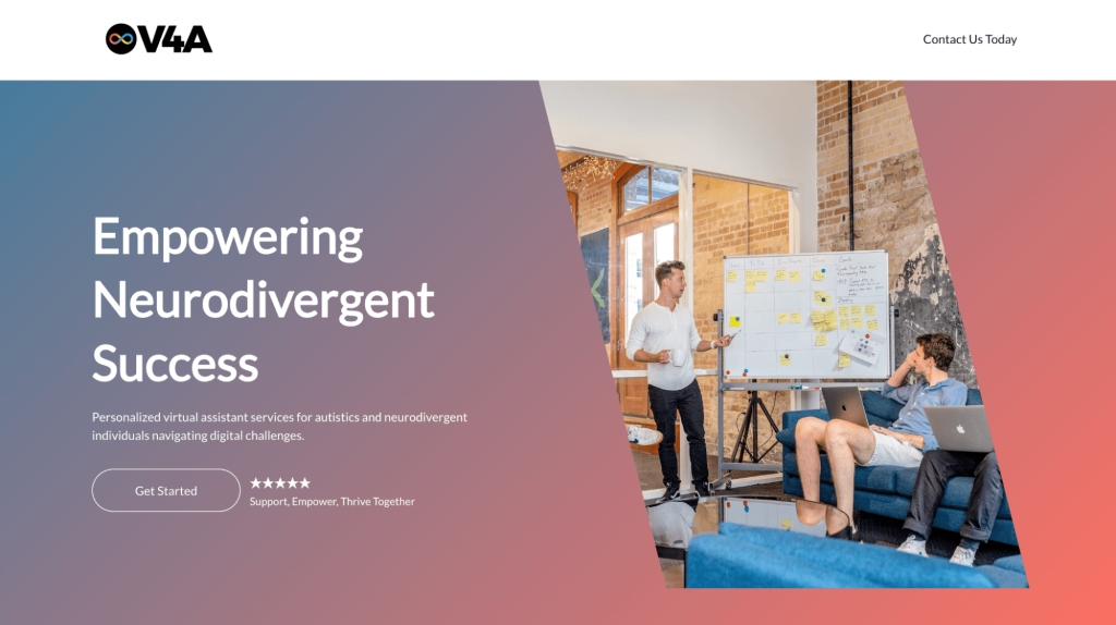
For charities, a one-page site is an effective choice when the goal is to convey a clear, focused message and drive specific actions such as volunteering or donating. The simplicity of a single page can boost engagement by making it easier for visitors to take action.
The Volunteer for Autistics website is a well-executed example of a one-page charity site that efficiently delivers all essential information without overwhelming visitors.
The site uses a linear structure to guide users through key sections, including an introduction to the cause, the organization’s mission, volunteer opportunities, and a contact section – all on a single page. This streamlined approach ensures a smooth user experience, minimizing the need for extensive navigation and helping visitors quickly find the information they need.
16. NYC Rim Rockers
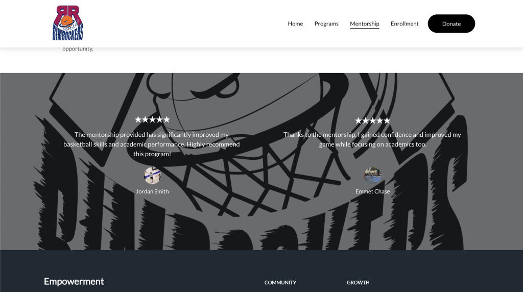
Including testimonials on a charity page is powerful because it leverages social proof to build trust and demonstrate impact. For a charity website, such elements can significantly influence potential donors, volunteers, or participants by providing genuine accounts of success and satisfaction.
The Mentorship page on the NYC Rim Rockers website effectively uses testimonials to highlight the impact of its programs. Featuring real feedback from participants adds credibility and authenticity to the organization’s offerings.
Each testimonial is paired with a five-star rating, a personal photo, and a brief quote about the mentorship program’s positive effects on athletic and academic performance. This visual and textual combination effectively reinforces the program’s value and encourages new participants to join.
17. Tread4MS
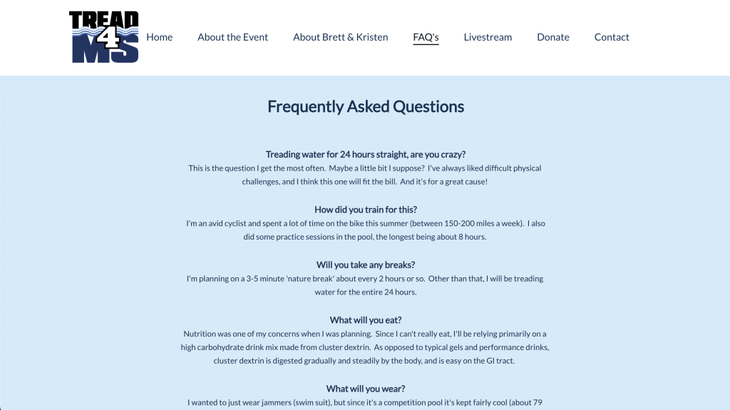
A well-structured FAQ page is invaluable for charity websites. It builds trust, promotes transparency, and reduces barriers to donation or participation by preemptively answering questions that potential supporters might have. This can lead to higher engagement, increased donations, and more volunteer sign-ups.
The FAQ on the Tread4MS website illustrates the benefits of having a dedicated FAQ section on a charity website.
The page provides clear and concise answers to common questions about the fundraiser, such as its purpose, donation allocation, event specifics, and ways to get involved. This helps visitors quickly understand the initiative and feel more confident in supporting it.
An FAQ page can address potential concerns, clarify details, and offer helpful guidance, enhancing the overall user experience.
18. Society of Helpers
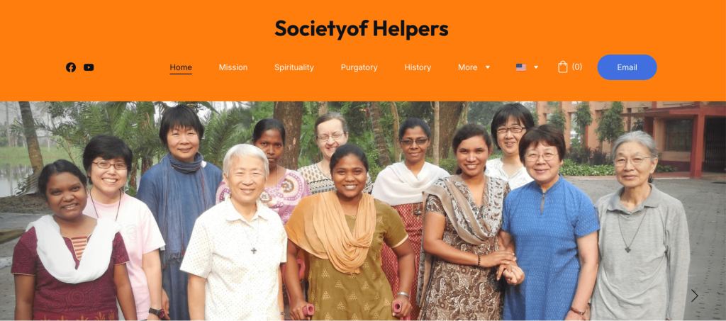
The Helpers Group China India website is a prime example of how a charity can use storytelling to build credibility and emotional connection with its audience.
The charity site’s history page details the origins, milestones, and growth of the organization, helping visitors understand the charity’s journey, mission, and long-term commitment to its cause.
This helps build trust by showing the organization’s journey and commitment while connecting with visitors emotionally, encouraging them to get more involved.
Conclusion
To create a successful charity website, combine compelling visuals with clear, action-driven content. Use bold hero sections, high-quality images, and videos to grab attention and immediately convey your mission. Ensure that key calls to action, like Donate Now or Get Involved, are prominent and accessible to encourage immediate engagement.
Building trust is crucial, so include transparency-focused pages that showcase your mission, values, history, and team members. Highlight your programs, achievements, and impact with concise content, images, and testimonials to connect emotionally with visitors.
Streamline the donation process with integrated eCommerce functionality and user-friendly forms for donations, ticket sales, and volunteer sign-ups to make it easy for supporters to take action.
Finally, ensure your site is easy to navigate with a clear layout, and use dedicated sections like FAQs to answer common questions, further building trust. By focusing on these elements, you can create an impactful charity website with Hostinger Website Builder and effectively drive engagement, donations, and long-term support.
Charity website examples FAQ
What elements should charity websites have?
Charity websites should have clear navigation, compelling storytelling, an easy-to-use donation process, mobile-friendly design, and engaging multimedia content. Including features like volunteer sign-up forms, event calendars, and transparent impact reports can also enhance user engagement.
What platforms or tools can be used to build a charity website?
Several popular platforms are available for building charity websites, each offering customizable templates and built-in tools tailored to charities. A drag-and-drop website builder like Hostinger Website Builder gives users access to secure donation forms, customizable templates, and an intuitive editing interface that makes it easy for beginners to create a professional site.
Are there free website templates for charities?
Yes, many platforms offer free website templates specifically designed for charities or include them in the monthly subscription fee. These user-friendly templates typically include essential features like donation forms, social media integration, and event calendars, helping charities create professional websites without a big budget.

Matleena is a seasoned Content Writer with 5 years of content marketing experience. She has a particular interest in emerging digital marketing trends, website building, and AI. In her free time, Matleena enjoys cups of good coffee, tends to her balcony garden, and studies Japanese. Follow her on LinkedIn


Comments
September 10 2024
My application is not working My problems is 403
September 11 2024
Hello there! Sorry to hear you're facing a 403 error with your application. This can be frustrating, but no worries—we’ve got a tutorial that can help! Check out this guide on How to fix the “403 Forbidden” error for detailed steps on resolving it ;)