Padding vs Margin in CSS: Key Differences + Tips

When editing a website using CSS, the most used properties for spacing out elements on a page are the padding and margin. For beginners, these terms may sound confusing. Plus, if applied incorrectly, they can lead to a messy web design.
Hence, this guide will explain in more detail the difference between padding and margin, how they work, and how to implement them in CSS. Extra tips are also available at the end of the article to help you use them properly.
Download complete CSS cheat sheet
What’s the Difference Between Padding and Margin?
The main difference between padding and margin is that padding is the space between the element’s content and its border, while margin is the space between the element’s border and the next element. Padding is used to create space within an element, while margin is used to create space between elements. Both can be adjusted using CSS, and understanding the difference is important for properly designing layouts.
Padding vs Margin: What Is It and When Should You Use It?
Both padding and margin are used to create a WordPress theme and customize the layout of a website. However, each has its own purposes and functions.
Padding
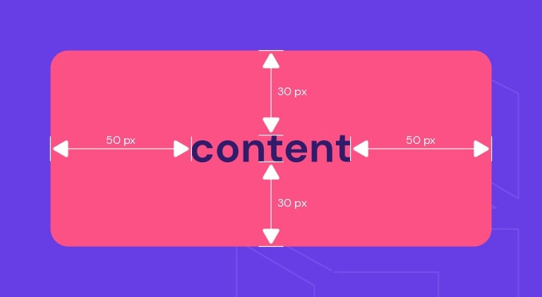
The padding property is what creates the space or area around an element’s content. It consists of the top, right, bottom, and left padding. In CSS they are written as padding-top:, padding-right:, padding-bottom:, and padding-left:. Their default values are 0.
To add padding to an element, you can set the values in:
- Length – a fixed value, usually in px, pt, or cm.
- Percentage – the size of the padding is relative to the width of the element.
- Inherit – sets the CSS padding properties to follow the parent element.
Keep in mind that you can’t use negative and auto values for paddings.
Here’s an example of a standard padding CSS code:
div {
  padding-top: 30px;
  padding-right: 50px;
  padding-bottom: 30px;
  padding-left: 50px;
}
Padding has a shorthand property – padding:. It simplifies the above code to a one-line code. This is to prevent having a long CSS file, which can slow down your site’s loading time.
The padding shorthand property can have from one to four values:
- Four values – when you need to specify the values of the top, right, bottom, and left paddings. The above code, for example, could be written as:
padding: 30px 50px 30px 50px;
- Three values – if the right and left padding have the same length, you can merge the right and left values into one. So, the code would be:
padding: 30px 50px 30px;
- Two values – the first value determines the top and bottom padding while the second value sets the right and left padding:
padding: 30px 50px;
- One value – when you want to specify one length to all four sides of the padding. For instance:
padding: 30px;
Keep in mind that when you fix the width of an element, paddings will add to the total width. Take the following example:
div {
  width: 250px;
  padding: 25px;
}
The total width of the element is 300px, or 250px plus 25px of right padding and 25px of left padding. If you want an element to have a specific width, do take the padding length into consideration.
Use padding when you don’t want the content of an element to touch the edges of its container. You can also use it to increase and decrease the size of web elements.
Take the button element, for example. The padding is the area surrounding the button label or text. When you edit the padding, it will affect the size of the button because you will either have more or less space around the text.
Margin
The margin property is the outermost layer of a web element. In other words, it creates space around the element. The property consists of margin-top:, margin-right:, margin-bottom:, and margin-left:.
Just like padding, margin can be set in length, percentage, and inherit values. However, it also supports:
- Auto – the browser will calculate a suitable margin value to use. It will usually center the web element.
- Negative values – sets elements closer to their neighbors.
The standard margin code is:
div {
  margin-top: 100px;
  margin-right: 25px;
  margin-bottom: 100px;
  margin-left: 25px;
}
In CSS, margin also has a shorthand property – margin:. It’s determined by the number of values as well:
- Four values – if you want to determine all four sides of the margin. For instance:
margin: 100px 25px 100px 25px;
Remember to write the values in order from the top, then move clockwise towards the left.
- Three values – applicable when the right and left margin have the same value:
margin: 100px 25px 100px;
- Two values – the first value applies to the top and bottom margin while the second value refers to the right and left margin:
margin: 100px 25px;
- One value – when you want all four margins to have the same length. For example:
margin: -30px;
To auto set the margin, simply type the code:
div {
  width: 250px;
  margin: auto;
}
It will horizontally center the element within its container. In other words, the element will take up the specified width, and the remaining space will be split equally between the left and right margin.
Use a margin when you want to move elements up, down, left, right, or center them. The distance between elements is also the work of margins. Other than that, margins can also be used to overlap elements.
For example, with the image element, you can use a margin to place another image on top of it. Alternatively, set a specific distance between the image and a text box.
CSS Padding vs. Margins vs. Borders: Differences
The main difference between CSS padding and margin is that padding is the space between the element’s content and border (within the element itself), while margin is the space around the border of an element.
Padding is a CSS property that works only on elements that have borders. It creates the space between the border and the content of an element. So, keep in mind that padding has no effect on elements that don’t have borders.
Margins form the space outside the borders of elements. Unlike padding, margins can still affect an element whether or not it has borders.
Another difference is that the background color of padding and borders can be customized, while margins are transparent – with them, the website’s theme background color will show.
The CSS Box Model
Every web page is made up of rectangular content blocks. They are arranged on top of, below, and next to each other. These blocks are what you call HTML elements.
The CSS box model is basically a container or box wrapped around every HTML element. It consists of:
- Content box – the area where your content is displayed, like texts and images.
- Padding box – it’s the space surrounding the content area.
- Border box – refers to the container between the padding and margin or the box wrapping the element.
- Margin box – the outermost layer or invisible space outside the border.
- Width – refers to the content area width of an element. Its value is 100% by default, but it can be set to a definite width.
- Height – it’s usually based on the length of the content, but setting a specific height is also possible.
Below is the code of a standard CSS box model with its preview:
{
 width: 250px;
 height: 100px;
 margin: auto;
 padding: 20px;
 background-color: cyan;
 border: 5px solid blue;
}
How to Add Padding in CSS
The following tutorial will show you how to add padding to a heading element on a WordPress post.
- From the WordPress Dashboard, hover over Appearance and select Customize.

- Click on the page or post you want to edit. Then, scroll down the side menu and click on the Additional CSS tab.

- Input the padding values for the H1 element. For example:h1 {
h1 {background-color: beige;background-color: beige;padding: 20px 100px;padding: 20px 100px;}}

- Save your changes.
How to Add Margins in CSS
Follow the steps below to add margins to an image element on a WordPress post.
- Navigate to WordPress Dashboard -> Appearance -> Customize.
- Select the post you want to edit. Find and click the Additional CSS tab from the side menu.

- Type in the margin value for the image element. For instance:img {
img {margin: -20px 5px;margin: -20px 5px;}}

- Save the edits.
Tips When Using Margins and Padding
Different content elements may work better with margins or padding. So take that into account when choosing between the two. Here are some other tips you might find useful:
- To add space within a column, use padding instead of margins if you’re building a responsive grid.
- Use padding on the columns if a web page has multiple columns that will stack vertically on a smaller screen.
- Use margin properties when adding space around the text, image, and container elements.
- Add bottom margins first to create consistent spacing between elements.
- When a container sits inside a column, add a bottom margin to the container. It’ll add more space when content stacks vertically on smaller screens.
- Use margins to space around buttons instead of padding as it affects the button styling.
- When you have an interactive element, use margins to add space around it.
If manually editing a website’s layout using CSS is too complicated for you, try a page builder. It doesn’t require coding and offers easy customization, saving you a lot of time.
Plus, the design you create will automatically be responsive. You won’t need to worry about making difficult design decisions regarding margins and padding. The website will adjust flawlessly on various screen sizes.
Conclusion
In CSS, both margin and padding add space to web elements, but each brings different results. Padding is the space between the content of an element and the border.
On the other hand, the margin makes the outermost space of the element.
For beginners, it can be a bit confusing to decide which property to apply when designing your website. However, you’ll become more familiar with them as you play around and experiment.
Hopefully, the tips mentioned in this article helped you understand their differences and when to use padding vs margin.


